Submitted by PsychologicalEgg9377 t3_11o7mmt in dataisbeautiful
Comments
thehallmarkcard t1_jbr9qrl wrote
Hard to identify much for major patterns in this but it may be because you have overlapping color labels making some of the industries indistinguishable on the chart.
Kool-aid_Crusader t1_jbrc0y7 wrote
Unlabeled X and Y axis? I'll pass.
[deleted] t1_jbrc1uw wrote
[removed]
Spillz-2011 t1_jbrdefn wrote
The axes don’t mean anything because they are nonlinear combinations of a higher dimensional data set. The only label you could put is x axis, y axis
maladmin t1_jbreen3 wrote
Interesting separation between real estate and utilities. What data is this based on?
PsychologicalEgg9377 OP t1_jbrefbl wrote
Some interesting things I found on the interactive website version:
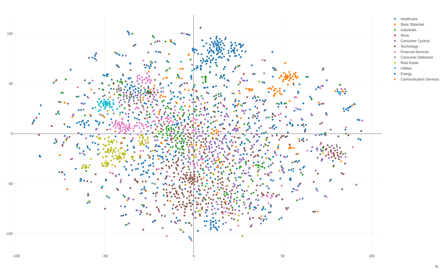
There's a group of Chinese companies (Baidu, Alibaba, etc). Las Vegas Sands and Wynn Resorts were in this region. After some googling, it turns out these two resorts get a huge amount of their revenue from China.
The "meme stock" region has all the favorites of a certain popular subreddit.
PsychologicalEgg9377 OP t1_jbreync wrote
It's built using only the daily percentage returns. The sector is shown for reference. In some cases (like real estate and utilities) they form tight clusters, but others (like technology) are all over the map. This makes sense because technology companies can vary widely in the technology they are offering.
DataMan62 t1_jbrnoc4 wrote
Wtf are all these pretty dots telling you?
They’re telling me nothing.
DataMan62 t1_jbrnxw0 wrote
I can’t tell which stocks trade like their group BECAUSE NOTHING IS LABELED!
goodluckonyourexams t1_jbrpz7a wrote
click link
PsychologicalEgg9377 OP t1_jbrqmco wrote
I assumed most people on this sub would be familiar with nonlinear dimensionality reduction but it looks some are not.
https://en.wikipedia.org/wiki/Nonlinear_dimensionality_reduction
This family of algorithms takes a data point that is normally represented in a high dimensional space and maps it to a lower dimensional representation. You generally lose information in the process, but in high-dimensional spaces there's often a lot of empty space that you can get rid of without losing much. The closest analogy I can think of is compressing a CD to mp3. You are losing information in the process, but if done correctly, the human ear can't tell much of a difference.
Why do this? One obvious reason is so you can plot highly dimensional data in 2D and 3D and get a better sense of certain spatial relationships. Once reduced, the vector components are difficult to describe in plain language. So it's not like "x is time and y is trades."
It's a confusing concept if you've never seen it before but it's very powerful and a common technique used in data science.
PsychologicalEgg9377 OP t1_jbrqr7z wrote
Tell me you are a data scientist without telling me you are a data scientist!
Turbulent-Key-5486 t1_jbrr9by wrote
energy/healthcare and communication services/basic materials share colors, yeah.
Traitor_Donald_Trump t1_jbrriu1 wrote
I assume each dot is an individual blue chip company, the color is an investment sector.
It makes sense, this shows most movement by big money managers and ETFs readjusting in sync.
rocket_labo t1_jbrta5y wrote
It’s hard to gain intuition about this plot as the legends don’t connect with the title. What trading patterns are you considering here (momentum, mean reverting, or chart patterns?) and why are they not represented in the legend?
Serprotease t1_jbrzgsc wrote
If it’s a PCA or similar, the labels are basically Dimension 1 and Dimension 2 so It’s kinda ok to skip them.
[deleted] t1_jbs2v83 wrote
dml997 t1_jbso47w wrote
Your axes aren't labeled and the explanation is vague, so I have no idea what this is supposed to show.
[deleted] t1_jbvxt7k wrote
[removed]
avl0 t1_jbxj93y wrote
Maybe a stupid question, but can you do a 3 dimensional version of this OP? i've always wondered why people use 2d for dimensionality reduction, clearly 2d over 1d offers better seperation of factors so surely 3d which we can observe just fine would be even better

PsychologicalEgg9377 OP t1_jbr6keq wrote
Interactive version at https://www.mapmystocks.com
Non-linear dimensionality reduction of daily stock trading patterns.
The visualization is built using daily returns. The color coded sector is only used for reference to see which stocks actually trade like their sector.
Some interesting examples are that Ford and GM trade almost identically, but Tesla trades like a tech company.
There's the possibility that some movement is just noise, randomness in the algorithm, or dumb luck. Only high volume stocks were included to help reduce noise. Written in angular and plotly.
Disclaimer: This is for entertainment only. Do not make any financial decisions using this.
Edit: Interactive version doesn't work well on mobile due to the number of data points.