Comments

You must log in or register to comment.

[deleted] t1_iwghpz6 wrote

Most of these layoffs are hardly a reboot. Just right sizing the companies now that COVID isn't forcing everyone to spend their money online.

5

Chris_Schmitz OP t1_iwg3gux wrote

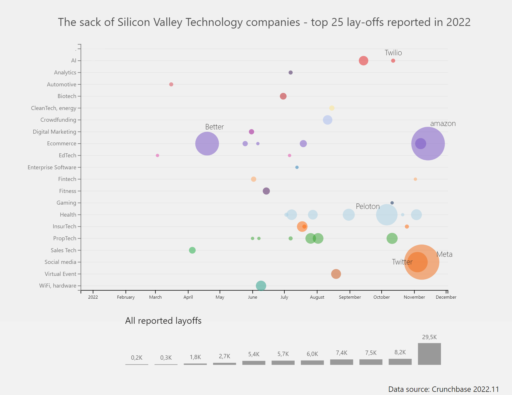
This chart is inspired by a chart of The Economist (ed. Nov. 12t) - the data is available on the website of Crunchbase - the recent announcment of amazon was added by myself manually. The chart itself is made with Power BI with a customized charticulator template.

The size of the bubble represents the number of layoffs.

2

being_outlier t1_iwgad4v wrote

I find your viz interesting because it considers the timestamp / date values of the layoffs to highlight the areas which are rebooting/revamping.

I did a treemap of layoffs across industry https://www.reddit.com/r/dataisbeautiful/comments/yvvtsb/oc_treemap_showing_the_layoffs_across_different/?utm_source=share&utm_medium=web2x&context=3 just a little while ago.

2

Chris_Schmitz OP t1_iwgbvbx wrote

thx for letting me know - the data sources are very interesting too ...

2

maugust09 t1_iwg3dgi wrote

I'm assuming the size of the bubbles are meant to represent the number of people laid off?

1

Big_Knife_SK t1_iwgemj7 wrote

It would be more interesting to see it as a percentage of their workforce. It's not surprising that the biggest companies have the most.

1

ChicagoJohn123 t1_iwhxjja wrote

We're all figuring out how to admit that every piece of data from March 2020 to March 2022 is useless. We're unwinding all the stock changes that came from that and we're unwinding the hires that came from that.

0