Comments
HeliSieni OP t1_ja01t9g wrote
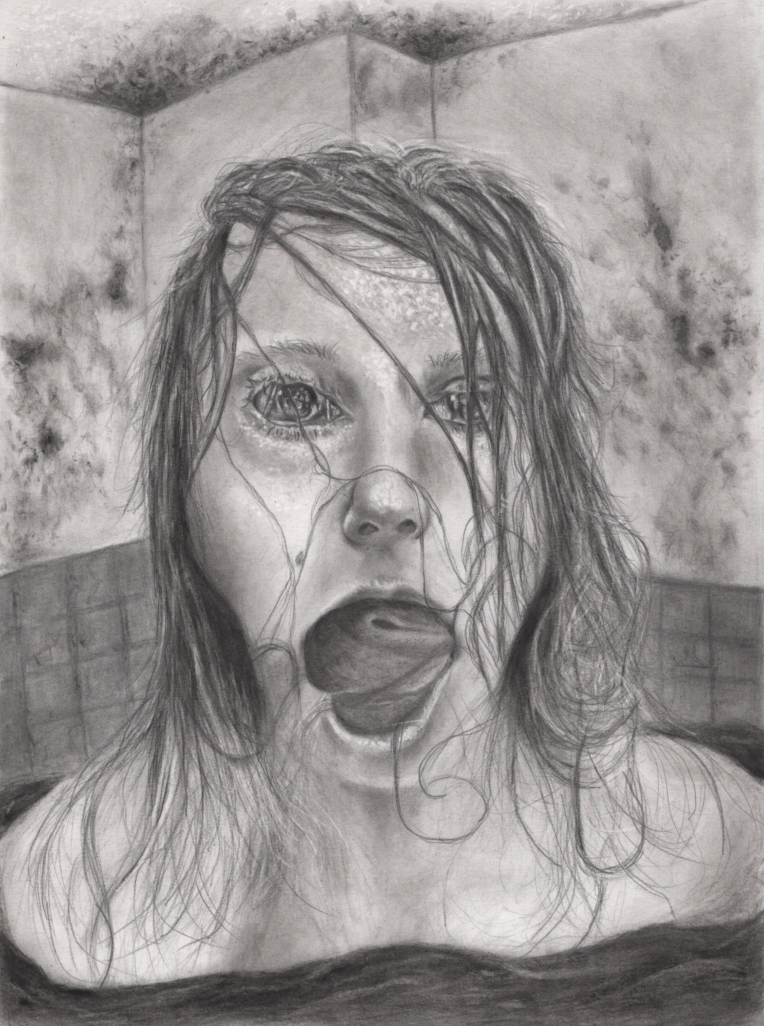
The final girl is the one who gets the revenge arc. The penultimate girl is the one who suffers the most
housemon t1_ja2gh6p wrote
Wtf does this even mean lol
Little_Hamlet t1_ja32vm8 wrote
It’s a reference to a horror movie trope, so the “final girl” is the girl in the horror movie who survives and kills the bad guy when all the other young people get killed, like in the Friday the 13th movies.
FartAttack911 t1_ja3erub wrote
r/iam13andthisisdeep
draculamilktoast t1_ja3jli3 wrote
r/iam13andcantdrawbuticanshitonotherpeople
[deleted] t1_ja5jr2c wrote
[removed]
DatFlyBoi06 t1_j9zyhsr wrote
What that mouth do
Rakebleed t1_ja1hzz6 wrote
Probably suck out your soul
sizz_lor t1_j9zqk8r wrote
Eerie
Funtclaps1988 t1_ja05elv wrote
I'm sure I saw this girl down at Tesco today. I live in that kind of town lol
Gooey2113 t1_ja1k6sq wrote
Spooky. Love the art and the title!!!
HeliSieni OP t1_ja2ftd0 wrote
Thank you!
exclaim_bot t1_ja2fu7j wrote
>Thank you!
You're welcome!
Gooey2113 t1_ja4ni0c wrote
Is there any possibility of buying a print of this? I’d love to have it on my wall.
Morsusdentes t1_ja20mdb wrote
This is so rad!
ratmand t1_ja38syr wrote
Looks like the Thing about to split open the head to get you.
Superloopertive t1_ja083x2 wrote
This is cool. What's going on in the picture? I want to know the story!
[deleted] t1_ja0fm1i wrote
[removed]
Embarrassed_Escape84 t1_ja17xtu wrote
Cool
UnbrokenWhite t1_ja1t1vd wrote
Something about the mouth actually made me yawn. Very visually striking.
Middleman86 t1_ja3l73g wrote
The just slightly off features are done so well. Its just enough to be really uncomfortable but doesn’t cross the line into cartoonish. Kind of hard to stop looking at it. The fuck is happening with the mouth?!?
HeliSieni OP t1_ja403ms wrote
Thank you!! I always try to use some references even for the more unnatural features. For this drawing it meant looking into medical eye conditions.The mouth hopefully keeps on bothering you in the small hours of the night
[deleted] t1_j9zjooh wrote
[removed]
[deleted] t1_ja0dhim wrote
[removed]
[deleted] t1_ja15fe3 wrote
[deleted]
defk3000 t1_ja1t14y wrote
Nothing
[deleted] t1_ja1dy7o wrote
[removed]
[deleted] t1_ja212td wrote
[removed]
Graulithe t1_ja2mmz5 wrote
Taylor Swift?
weirdcore_enjoyer t1_ja42m4c wrote
why she look like she has a mouse in her mouth
noradicca t1_ja9bwnh wrote
I don’t know what penultimate means (don’t want to google). But she’s got something nasty in her mouth. Not in a kinky way.
AHADDABOSS t1_ja2vevw wrote
Get help
housemon t1_ja2gfqa wrote
Style needs work
HeliSieni OP t1_ja2hl25 wrote
Well, don't leave me guessing. How would you improve it?
housemon t1_ja2jnoy wrote
Vanishing lines/perspective points don’t match.
The delineation between the wall, tile, and water is sort of nebulous and hard to parse.
No reflection on water.
Water level doesn’t match.
Top of the head is oddly flat.
Tongue doesn’t make any sense. Nor do the irises.
this may have been deliberate, but I can’t tell, so listing it.
Don’t get me wrong. Not saying your work is bad. Shading is fantastic and I think you have something to convey that is awesome. Don’t know what the hell you meant with the “penultimate” but no biggie. But the foundation needs work. Vanishing lines first is my recommendation. If you mess those up everything feels off. Good piece though.
Oh also no chin or jawline to speak of, and actually doesn’t look like a girl at all.
HeliSieni OP t1_ja2mvpp wrote
Thank you. Perspective is definitely something that needs work, I agree.
Sleevey27 t1_ja33cuq wrote
Perspective is hard. I’m struggling with it as well. I disagree with some of their points - especially the last sentence - and I certainly disagree with their tone. Scrolling through your profile, you obviously have a lot of skill and a good eye. And I think I know exactly what your title means.
HeliSieni OP t1_ja3yf9m wrote
Many thanks, your comment really brightened my day :) It's definitely difficult to pick up the potentially useful criticism when the tone is unkind -but that's to be expected when sharing on reddit

only_the_office t1_j9zzztj wrote
Penultimate means “second to last,” is that what you meant? If so, then who is the last girl?