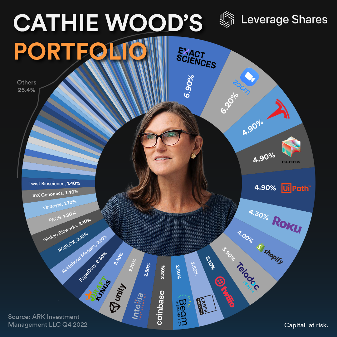
Submitted by LeverageShares t3_10v6wdl in dataisbeautiful
Comments
[deleted] t1_j7fpa51 wrote
[removed]
st4n13l t1_j7fpg78 wrote
Thank you for posting a perfect example of the opposite of what should be posted here. It's helpful for other users to have an example of ugly data visualizations.
Seriously, you knew how many pieces it would have and somehow still decided a donut chart was a good idea.
Then you created the visualization and saw how difficult it was to make sense of with that many pieces and still decided it should be posted to r/dataisbeautiful.
BourboneAFCV t1_j7fppfu wrote
Worst ETF, down like 99%
​
And she is just gambling and buying Tesla like crazy, she belongs to WSB
chadd283 t1_j7fqmr1 wrote
buy the SARK etf. the reverse cramer for cathie 👌🏽
[deleted] t1_j7fs5yw wrote
[deleted]
Ok_Champion6840 t1_j7fs82a wrote
A treemap would be good for this.
jonsnowden- t1_j7fuwh7 wrote
I think next time you should also involve OP's family in this disintegrating roast process I just witnessed. To end the suffering of their mediocre existence. Because st4n13l is a merciful god.
realized_loss t1_j7g1hav wrote
What is her infatuation with roku??
Stratedge t1_j7gos0q wrote
OP doesn't have a family; it's a business and this is an ad. As an avid dataisbeautiful follower, this offends me.
As an investor, the actual portfolio offends me even more though. These are a lot of low upside, high downside stocks. Traditional thinking would call this a safe, keep pace with inflation strategy, but I think it's more Russian roulette. Plenty diversified, though, hence why the data isn't beautiful.
Edit: If it were me I'd have organized the assets by some kind of grouping... sector or some kind of selection criteria that implies why it's supposed to be a good portfolio.
FordPalmer43 t1_j7gq4zu wrote
Please make sure to do this graphic for Buffet when released on the 15th.
[deleted] t1_j7h25w2 wrote
[removed]
cepegma t1_j7i0djo wrote
as rule of thumb, pie chart are good in mos situation when you have to display up to 3 categories. This because it becomes impossible to read properly very quickly. In addition, it's not good to use pie charts when the area of the sectors are quite similar. this because the average human eye has problems to notice differences when the area difference is small
throwaway129655 t1_j7jgady wrote
Tesla has been great.
[deleted] t1_j7jgj52 wrote
[removed]
Savings-Round-2228 t1_j7kvozx wrote
AldusPrime t1_j7liwpn wrote
SARK is awesome. I mean, I don’t actually have it in my portfolio (I’m too Boglehead for that) but I love that it exists.

LeverageShares OP t1_j7fp38p wrote
Source:
Tools Used: