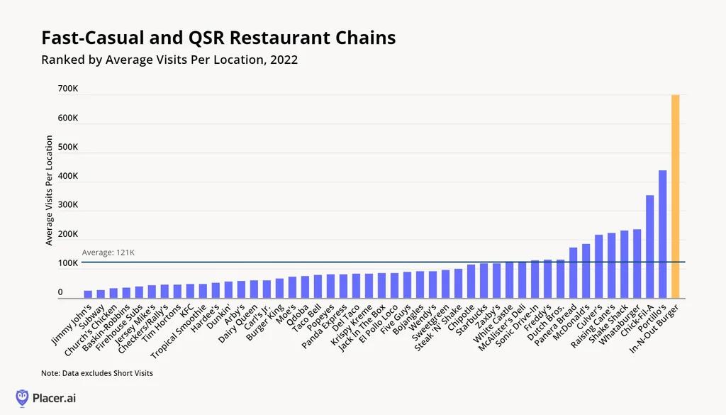
 [OC] Fast food restaurant chains ranked by average number of visitors per location in 2022
Birdy_Cephon_Altera t1_j8g2ak3 wrote
One thing I might be interested in seeing is a plot graph with visits per location on one axis, and number of locations on the other axis. Then some outliers might really stand out - like McDonald's high on both axes, while Church's on the other end of the scale, low on both axes.
WhyCloseTheCurtain t1_j8gzbp0 wrote
Upvoting the first comment on the data presentation rather than the experiences with the various chains.
[deleted] t1_j8ka8md wrote
[removed]
Viewing a single comment thread. View all comments