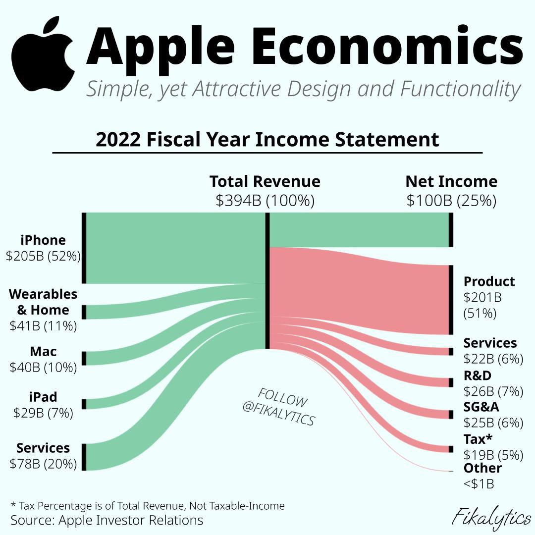
 [OC] Apple’s 2022 Income Statement Visualized with a Sankey Diagram
Submitted by Square_Tea4916 t3_119hbu5 in dataisbeautiful
crimeo t1_j9r6kiz wrote
Reply to comment by cyberentomology in [OC] Apple’s 2022 Income Statement Visualized with a Sankey Diagram by Square_Tea4916
What do you mean? It shows you how much of the total inflow vs outflow (the whole point of this graph) through the entire company's finances is tax.
It's as meaningful as any other branch of any other Sankey diagram. Obviously people consider them quite meaningful in general, since there's been like 50 of them upvoted to the top of this subreddit recently.
cyberentomology t1_j9r6phz wrote
The dollar amount is meaningful, the percentage is not, as tax is not calculated on revenue.
crimeo t1_j9r7m3s wrote
Nobody claimed tax is calculated on revenue...? Nowhere in the OP does it say "the purpose of this graph is to understand how Apple does their taxes" nor did I say any such thing. Read what I said:
> It shows you how much of the total inflow vs outflow (the whole point of this graph) through the entire company's finances is tax.
Why are people interested in that? I don't know, maybe you should ASK them, instead of deny that the obvious popularity of these graphs is real and gaslight everyone.
Obvious_Chapter2082 t1_j9r96p9 wrote
That’s not what income tax expense is though. It doesn’t have anything to do with the inflow or outflow of tax
crimeo t1_j9r9jb1 wrote
Can you please draw a circle around where in this graph or in any of my comments, you encountered the term "income tax expense"?
My brother in christ, it literally just tells you how big the flowy bit of the sankey diagram is on the right versus the flowy bit on the left, it's not that complicated. YOU'RE the only one talking about (and incorrectly assuming everyone else is too) specific tax jargon and normal/official types of tax metrics.
Obvious_Chapter2082 t1_j9rbzfy wrote
…income tax expense is the tax portion of the chart, it’s literally what you and the other guy were talking about this whole time
You just said that that specific portion of the sankey chart was measuring the inflow and outflow
crimeo t1_j9rcmk6 wrote
The chart makes crystal clear that what it's showing is tax as a portion of revenue.
You said "That’s not what income tax expense is though." So by your own definition, your term you used cannot possibly be referring the chart, since you said it doesn't mean tax / revenue, yet the chart very clearly shows tax / revenue.
Pick one:
-
You're talking about [tax / revenue] (if so, why did you say that that wasn't what the term you used meant if it was...?), OR
-
You're talking about something not in this chart (if so, why are you off topic?)
Obvious_Chapter2082 t1_j9rd5hf wrote
This sankey diagram comes from their income statement. The tax data reported on an income statement is “income tax expense”, which is $19B for Apple, and what’s reported on this specific sankey diagram. It’s what you’ve been referring to, but your wrong that it’s the inflow/outflow of tax, because that’s not what the sankey diagram is showing in the tax amount reported
crimeo t1_j9rdkr2 wrote
> The tax data reported on an income statement is “income tax expense”, which is $19B for Apple
That's the SCALAR amount on the chart.
We have been talking about the PERCENT written next to it.
The percent (5%) is very very clearly indicated on the chart as $19B (all tax paid) / $394B (total revenue) = 4.82% rounds to 5%.
AKA total taxes / revenue. So if you were ever talking about a % other than taxes / revenue, you were simply off topic. Nobody ever claimed that was their tax rate, or anything else, just total taxes / revenue.
Obvious_Chapter2082 t1_j9rdz90 wrote
Again, having a 5% rate there doesn’t mean that their tax was 5% of their revenue though, that’s what I’m trying to say
crimeo t1_j9refg3 wrote
Cool story, nobody claimed it did or that 5% was their tax rate, at any point. Again, why are you just listing random fun facts off topic from the thread in response to nobody?
The graph says it is tax / revenue, it does not say it is their "Tax rate". It did not mix it up, there was never any error, you and the guy at the top of this comment chain just pretended something was said that wasn't, then "corrected" an imaginary error you made up. The chart even went out of its way to give you an asterisk telling you that that wasn't what it was talking about, which you still ignored.
Obvious_Chapter2082 t1_j9rlb8y wrote
Dude, why do you keep shifting your argument?
>19B (all tax paid) / $394B (total revenue) = 4.82%
Again, not true. The 19B isn’t the tax they pay. I’m not claiming there’s an error in the chart, I’m claiming that your analysis of it is incorrect. You’ve said several times that this $19B is the tax they pay, and that’s why I originally told you that was wrong
crimeo t1_j9rm5ze wrote
> I’m not claiming there’s an error in the chart
plus
> The 19B isn’t the tax they pay.
plus
[The fact that the chart quite clearly says "Tax" in red, the color for outgoing costs they paid, with $19B next to it]
You are contradicting yourself. Chart says they paid $19B in tax, you're saying $19B isn't the tax they pay. So therefore yes, you're saying there's an error in the chart. But then you say you're not saying there's an error in the chart.
Obvious_Chapter2082 t1_j9rpsbv wrote
Point to me where the chart says $19B is the tax they pay. Literally the only thing it says is “tax”. You’re the one who keeps saying it’s the tax they pay. Which is why I’m saying that you’re wrong, not the chart
crimeo t1_j9rq7af wrote
> Point to me where the chart says $19B is the tax they pay.
Okay: https://imgur.com/a/AdTIdUi
> Literally the only thing it says is “tax”.
Yes, IN RED which is for paid costs by the company. jfc.
Clear low tier trolling at this point. Bye.
Viewing a single comment thread. View all comments