Submitted by transformersh t3_y1wke0 in dataisbeautiful
Comments
HereItsDani t1_is0a6t6 wrote
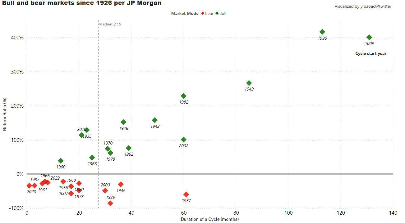
I mean, how can we scaled this to make it significative? Maybe log10?
A bear market of down 50% is not the same of a bull market of 50%, so I feel the Y axis could be fixed a bit
[deleted] t1_is0cg7p wrote
The data is linear in y, further complication is not necessary
randomando2020 t1_is0wo8w wrote
This would be more beautiful if X axis was years and the cycle in months was indicated by wave lines between the two points.
Kind of a confusing perspective that makes it hard to glean info right now.
itswill95 t1_is25v4n wrote
is it linear though? it would take a 100% gain to recover from a 50% loss. If market was the same price today as it was in 1926 you'd expect to see higher deviations from 0 above the x axis
transformersh OP t1_is49x1c wrote
thanks. Are you thinking about this view: https://skloff.com/wp-content/uploads/2017/05/us-bull-markets-bear-markets-1903-2016.jpg?
randomando2020 t1_is4a5b8 wrote
Yes that’s pretty decent. Current one displayed, while I see where you were going with it, requires too much effort on the user side to get acquainted with and interpret it.
Coming from experience, we have the burden of knowledge when making this stuff so we’re overly familiar with what we’re doing and how we might extract conclusions from it.

transformersh OP t1_irzqtbu wrote
Developed via Power BI; Source data: https://mahopacmoney.com/2020/04/15/whats-the-difference-between-a-pullback-a-correction-and-a-bear-market/
More of my other visualizations can be found at this post.