When choosing a color palette you should consider the type of data you're dealing with. For example, don't use a diverging color scheme intended for continuous data when the data is actually categorical. There may be cases when this may be appropriate, such as when the categories represent ordered levels but not when we're dealing with companies names. Also, avoid using the same colors to represent different things within the same visualization.
PlasticWriter407 OP t1_itcx8f7 wrote
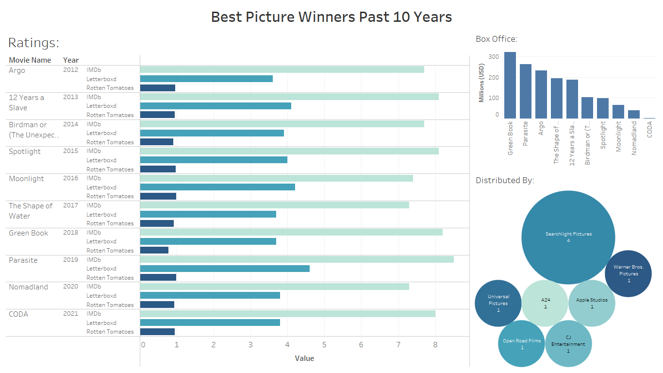
Source: Academy Award for Best Picture, IMDb, Rotten Tomatoes, Letterboxd
Tools: Tableau, Ms. Excel