Submitted by icywatermelons t3_yrkv8b in dataisbeautiful
Comments
According_Ad_8396 t1_ivue517 wrote
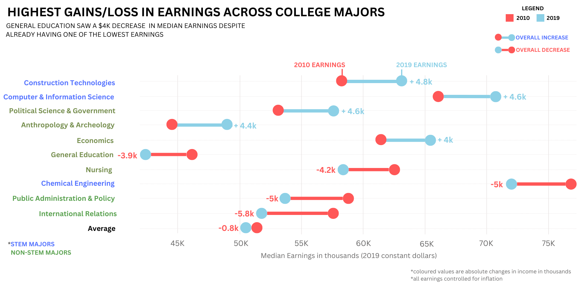
Interesting graph but really difficult to read due to the colors. I'd probably just do arrows, and you could color them blue/red depending on an increase/decrease.
SierraTargon t1_ivuhaz2 wrote
Maybe a graphic indication that this is the top and bottom 5 as well: add a space in the middle with some ellipses or something of the sort.
Dwarf_Druid t1_ivururd wrote
What type of graph is this?
icywatermelons OP t1_ivwaend wrote
it's a barbell chart!
thunder-thumbs t1_ivwgdin wrote
Why is nursing going down?
[deleted] t1_ivwi3ac wrote
[removed]
AnonymousTaxi t1_ivx0h1a wrote
Because it’s a lucrative field with major growth and future advancement. /s
Dwarf_Druid t1_ivx6txs wrote
Ah! Thank you! So many different ways to display data, it’s hard to know which charts/graphs are which and keep track of what they’re called! :)
Mic1994hael t1_ivyjkx4 wrote
Any field that is viewed as a lucrative field will eventually produce graduates until it is no longer lucrative
WingerRules t1_ivzbxo9 wrote
Sad to see education not only so low but actually getting worse.
tacocandoit t1_iw750rx wrote
What is this type of graph called?
icywatermelons OP t1_iwbdl6d wrote
its a barbell chart!
DJpuffinstuff t1_iwlof2o wrote
This probably varies so much that it would be irrelevant. Sociology degrees and chemical engineering degrees basically cost the same within a school. The biggest difference will be scholarships and cost of the school.

icywatermelons OP t1_ivu3hon wrote
Link: https://nces.ed.gov/programs/digest/d20/tables/dt20_505.10.asp?current=yes
Note: Top 5 and Bottom 5
Tools: Datawrapper and Canva