Comments
Bischrob OP t1_iwe2t1y wrote
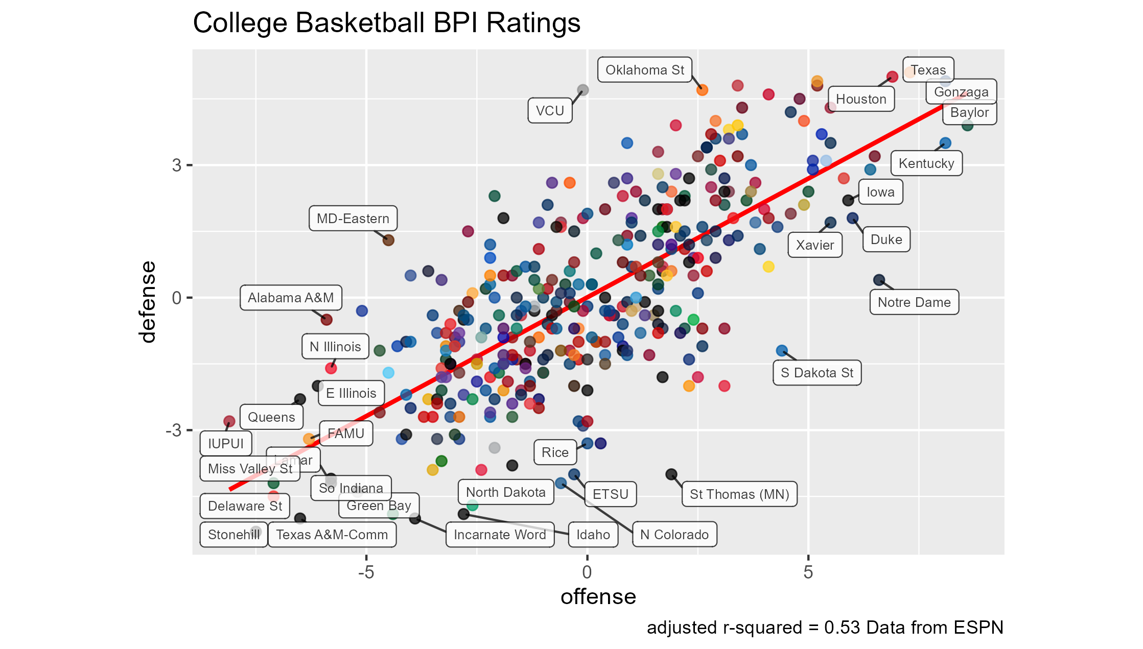
Indeed, I plan on making this a weekly update, next week's data will be animated to show the difference from one week to another.
CoachMorelandSmith t1_iwe952x wrote
Have you considered rotating this 45 degrees counterclockwise?
Bischrob OP t1_iwe99wq wrote
I've seen a couple people do that but I'm not sure how I feel about it. I assume it's your preference?
CoachMorelandSmith t1_iweartr wrote
kenpom started rotating their equivalent graph a few years ago and I think it makes sense, if the main takeaway is who are the top and bottom teams.
Doing it your way is probably better if the main intent is to see who are the good and bad teams at either offense or defense. However its harder for some viewers to visual overall team strength correctly without the rotation.
Bischrob OP t1_iweawzs wrote
I'll have to explore it, thanks 👍

Bischrob OP t1_iwdz52u wrote
Interactive version: https://bischrob.github.io/RScripts/public/CBB-BPI-widget.html
Made in R using ggplot and plotly (for the interactive version) with data from ESPN.com
BPI explanation: "The Men's College Basketball Power Index (BPI) is a measure of team strength that is meant to be the best predictor of performance going forward. BPI represents how many points above or below average a team is."