Nice interactive static image. Thankfully I can just search for exactly the title and find a few interactive representations of the same data.
edit: oh the OP did post a link, but it somehow got lost by someone else's comment being removed.
Speaking of which, why the hell doesn't reddit let someone post multimedia, hundreds of thousands of other sites have managed that for decades. "text and images together? No can do!"
Yeah, I was very confused by this as well. Only when posting multiple images could I add captions/links in the main post. If there’sa better format please lmk, this was my first post but see the top-level comment below.
Made with react, nivo/d3 and some vanilla web code. Please see the interactive version here, you can slide through the different years where we have all three datapoints ordrill deeper down into more visualizations...
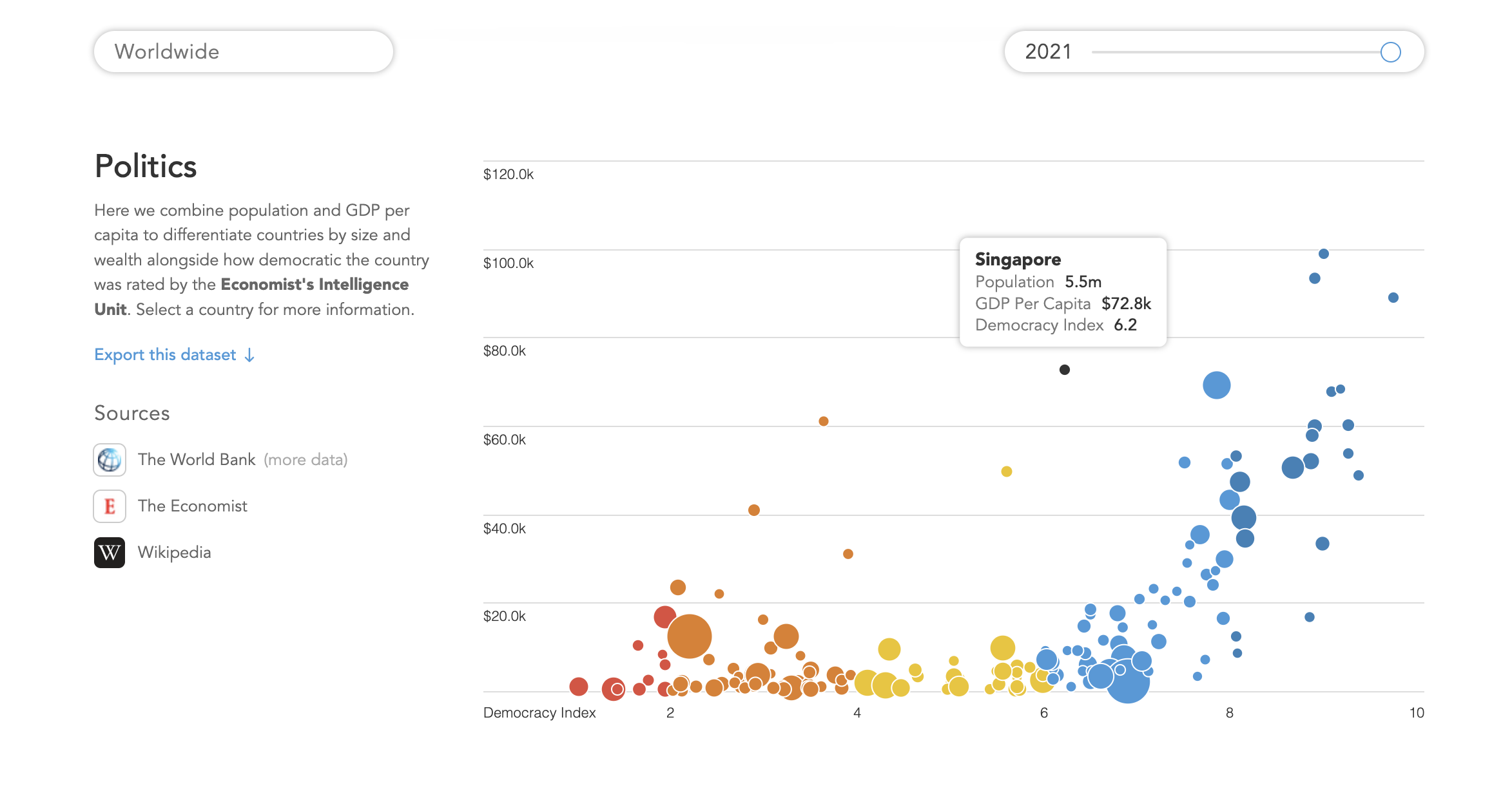
Same as the x axis, they just correspond to the democracy index score. Maybe a smooth gradient or some other metric applying to the color could've been more interesting?
st4n13l t1_iwjpdya wrote
Where's the link to sources and tools used? Also where's the link to the actual interactive visual?