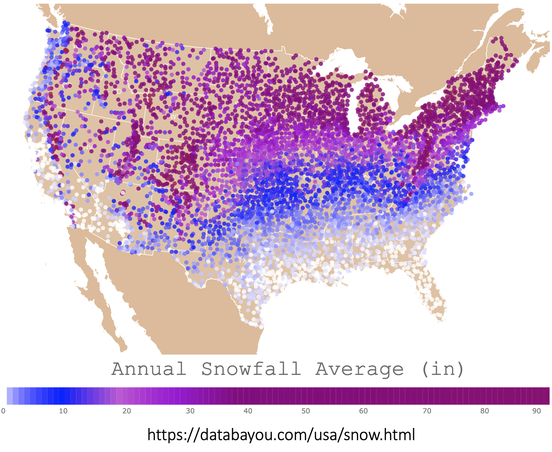
 [OC] Average Annual Snowfall in the USA
Submitted by No_Statement_3317 t3_zoxccq in dataisbeautiful
goldfishpaws t1_j0pify0 wrote
Zero snow is white and lots is purple! Infographics generally benefit from being instinctive, so for instance rainfall shown in blues, sun as yellows, so it might be worth stepping back to the project thinking about colouring and what it conveys in itself, to make it feel more instinctual :)
monozach t1_j0sq2ah wrote
Totally see where you’re coming from, and not sure if it’s maybe just a regional thing, but where I’m from the above coloring is exactly what they use on radars to show the amount of snow a given area is expected to get.
Are you possibly from a place that doesn’t get much snow? Or does New England just use weird coloring schemes lol
Pirate_Green_Beard t1_j0tnr25 wrote
I've always seen weather maps use a green to red gradient, with green being a drizzle and red being a downpour or blizzard.
But that's for maximum contrast.
Viewing a single comment thread. View all comments