Comments
Scottzurp t1_j1u7kyn wrote
What is this trying to show?
mateusb12 t1_j1u82h6 wrote
One of the most exciting World Cup matches so far. Team1 vs Team2
Sadgasm1 OP t1_j1u8bjs wrote
Hi :)
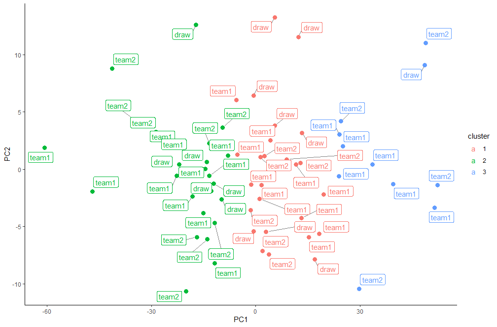
I tried to extract 2 meaningful PC’s from 59 analytics of the matches (variables like ball possession, goal attempts… etc). Then I wanted to see if the matches are clustered on these predictors according to their outcome.
They aren’t 😕 but I liked the plot
Sadgasm1 OP t1_j1u9eh8 wrote
lol
Each row in the data is a match, so ‘team1’ represents a win for the “home” team, ‘team2’ represents a win for the “away” team and ‘draw’ represents a draw.
Extra_Intro_Version t1_j1ujmak wrote
This needs a lot more work to make it beautiful.
back-in-green t1_j1wrgtb wrote
I like your effort here, thanks for that. But the image is not clear, what is it trying to tell us?
stoooflatooof t1_j1wyzc6 wrote
What kind of labels are we looking at? Show the pca loadings too please
TheGoatzart t1_j1xwe1m wrote
But home and away are totally arbitrary in this context, with the exception of Qatar. So how does that characteristic provide any benefit from an analysis or presentation standpoint?
Sadgasm1 OP t1_j1yfh7h wrote
Oh yeah generally youre right, but the data was also ‘doubled’ in this way. Because each row is a match, the variables are present for each team separately. For example: there’s attempts from outside the box by team1, and attempts from outside the box by team2. The pattern of relation should be symmetrical because these differences are arbitrary as you say.

Sadgasm1 OP t1_j1u5dug wrote
I have used IRON486's dataset that he scraped from fifa.com and posted on Kaggle.
I have used R and posted the script as an R notebook on here.