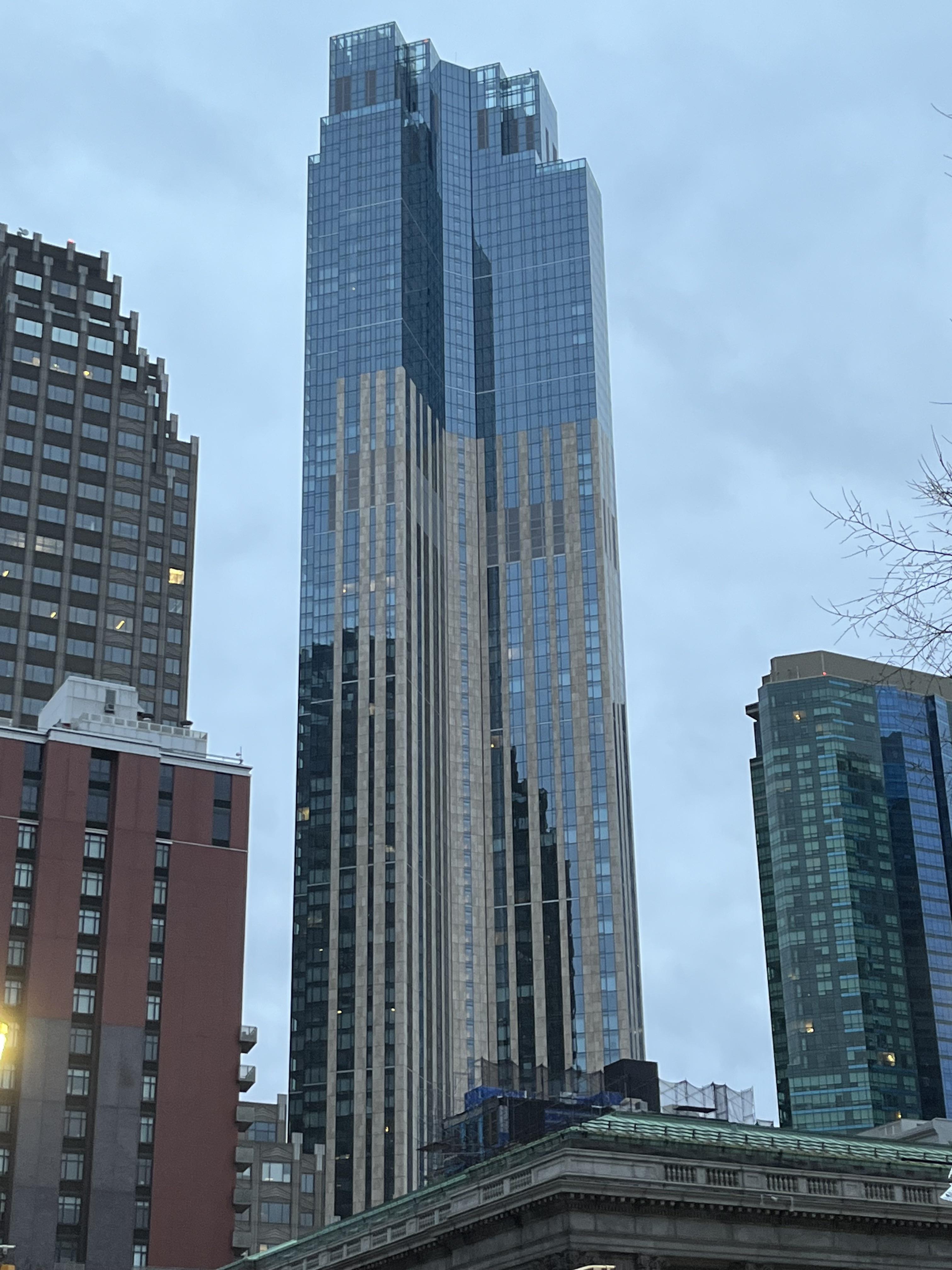
 Why does the contrasting color (stone?) not go all the way up? Was this really the original design or did they cut costs half way up?
fruit__gummy t1_j59vsz3 wrote
It’s the design and imo it looks great and is very unique to jersey city
G_Funk_Error t1_j5a0zrm wrote
It looks unfinished.
extraORD1NARYmachine OP t1_j5aq4hd wrote
Yes, thank you. My thoughts exactly.
fruit__gummy t1_j5bs8qv wrote
In my opinion it doesn’t. I really like how the strips of stone and glass contrast with each other. It’s an interesting integration of old vs new styles of skyscraper
G_Funk_Error t1_j5bsjqo wrote
I’m sure that’s what the spin is in this but man that was not executed well at all.
fruit__gummy t1_j5bsvyt wrote
I like how it’s executed
G_Funk_Error t1_j5bsyx4 wrote
Then you have abysmal taste. Or you work for them etc. sorry.
fruit__gummy t1_j5bt4js wrote
??? Damn just sharing my opinion, no need to be rude
G_Funk_Error t1_j5btahl wrote
Not being rude. Offering my counter opinion. Welcome to JC.
fruit__gummy t1_j5bunc1 wrote
Lol
glo46 t1_j5a9aun wrote
Agreed. Imo, it's the nicest looking "skyscraper" in Hudson county, and looks better than most in Manhattan
Viewing a single comment thread. View all comments