Submitted by Woodworking33 t3_zzk1p0 in Maine
Submitted by Woodworking33 t3_zzk1p0 in Maine
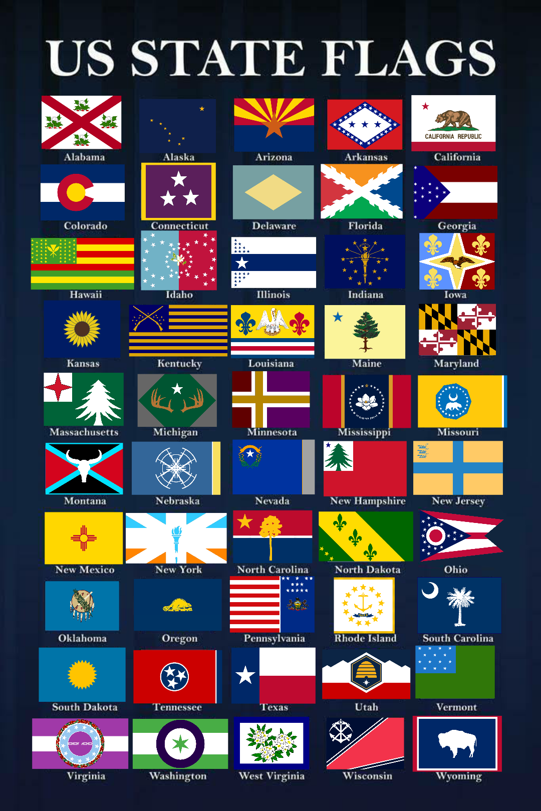
Tree is way too detailed and yet still somehow looks wimpy and malnourished. And the blue of the star is weird. I think it would be better if they made it more minimalist and incorporated some coastal imagery and maybe some indigenous and French elements
That's not the Maine flag
Our current flag is shit. We should return to this flag, as it's actually distinctive.
To each their own I suppose, I like the current one more than this old one.
Why? It's a blue flag with the state seal in the middle. Tell me, if you glanced at a row of state flags quickly, could you pick out the Maine flag from New Hampshire, Vermont, New York, Pennsylvania, or any other number of state flags which are a seal on a blue bedsheet?
Of course you couldn't. Because the design is garbage. Flags should be simple and distinctive. Our current flag fails at both.
There is no need to downvote me and be upset about it. Everyone has different preferences and likes. I personally don't really care if our flag stands out from others. I like the blue, and I like the design of the seal, so it being our flag doesn't bother me at all. Also, as long as the print of the flag wasn't tiny, I could pick ours out because I know what the design is. Lol Again, to each their own. I'm not hating that you like the old one more, just simply stating that I like the current one just fine.
i agree with you. people always complain and say the maine flag is awful but i love the farmer and sailor
The current flag is distinctly unique in the sense it is the only state flag (to my knowledge) that has a guy with bare feet/toes in it! Love it or hate it, that’s gotta give it some kudos points.
I like the current one because it actually shows what Maine is all about. Men representing the sea and the land, a moose, pine trees, and our motto Dirigo. I absolutely can pick it our from other state flags of that style.
If you cannot pick out the Maine flag from the others, maybe learn a bit about what it means.
I totally agree, but it's not our current flag
Look at all the flags there. You'll realize quickly that most aren't the official flags it's an interpretation of what each state's flags should be.
Fun fact: the flag in common “official” use is also not the legally designated flag.
I am aware
That's not the current Maine flag, but that flag looks a lot better stacked up to the other ones.
This is literally a cross-post of “redesigned” state flags.
Granted, that’s just the 1901 state flag so it was the state flag for a second.
I'm not used to hearing other Mainers say "y'all". That always throws me when I hear it.
Jesus another out of stater bitching about the flag what a surprise.....yes theres 2 white guys on it get over it.
If it bothers you that badly take a brown crayon and give em a tan
Am I the only person who thinks the 1909 Maine flag looks like shit? It looks way too simple with not enough personality for our state. To me it screams "Some kid could make this in MSPaint in less than a Minute" The New Mexico flag is a great example of something simple but with personality and history. The symbol on it comes from their native tribes. A tree and a star doesn't scream Maine, nor does it represent us or have history behind it.
People in 1909 thought that too. That's why they changed it. :P
You’re not alone. I also don’t care for it. I like our flag with a seal/crest element. I really hope they never formally change it.
argg.. our current flag is ugly and boring.
And looks like about 20 other state flags that all did the same thing. The state seal on the blue background.
I'm not crazy about the 'old'/'new' flag.. but it's miles ahead of the one we have and if that's what it takes to get it changed then I'll go for it.
Leave the flags alone.
NO. I’m from Maine and now live in Virginia and both of them are a big fat NO.
Some of these look awful. That NY flag is straight trash. And what is Nebraska supposed to be? A cracked windshield on farm equipment? The Vermont flag looks like something a first graders would design.
That pine is way better than the crude cookie cutter cutout you see all over the place (like the icon of this sub) and truer to the original. A+
I am not a fan of any of the old versions. Most of them look like they were drawn by a kindergartener. The "more detailed" version is slightly less objectionable to me but I don't really care for any of them.
I don't like it.
[deleted]
[deleted]
Did they have a stroke while making this? It’s like they took the Maine flag and tried to make it… semi-realistic, and then looked at it cross eyed and went, “that’s cool, let’s just re-do it as the Mass flag”
It's the actual original Maine flag before the blue seal one.
The difference between Wisconsin actual state flag and the one shown here are stark. This one is unrepresentatively cool.
Idk, but at least they didn’t f with Maryland
I'm too distracted by the "graphic design is my passion" style Massachusetts flag. Yikes.
It honestly looks to me like the Maine flag (original) fell into the New Hampshire flag, sucked up the background color, and fucked off back up north. Or Down East, as the case may be.
I dunno. Many of the current state flags look just fine, but for sure some of these interpretations are weird at best (looking at you, New Jersey). And the Tennessee one strongly reminds me of the logo of the New England Revolution soccer team.
I like South Carolina’s best.
Original Maine flag and South Carolinas flag are the absolute best
I really think that flags need to be more simplistic...which is why I love the old Maine flag over the current one.
[deleted]
What the hell have you done to North Carolina?
Yes, very nice.
Soo.... I know that this is the Maine sub.. but does anyone know why a possible NJ redesign would be Yellow with a blue cross? It reminds me of the Swedish flag only backwards... but there must be more significance to it than that..
[deleted]
Not the PA flag
Well it could be like back home.
https://media.notthebee.com/articles/61d73067a9f9861d73067a9f99.jpg
Mikerm3 t1_j2cg0f6 wrote
flag redesign = pulling a picture of the 1901-1909 flag from wikipedia
https://en.m.wikipedia.org/wiki/Flag_of_Maine_(1901–1909)