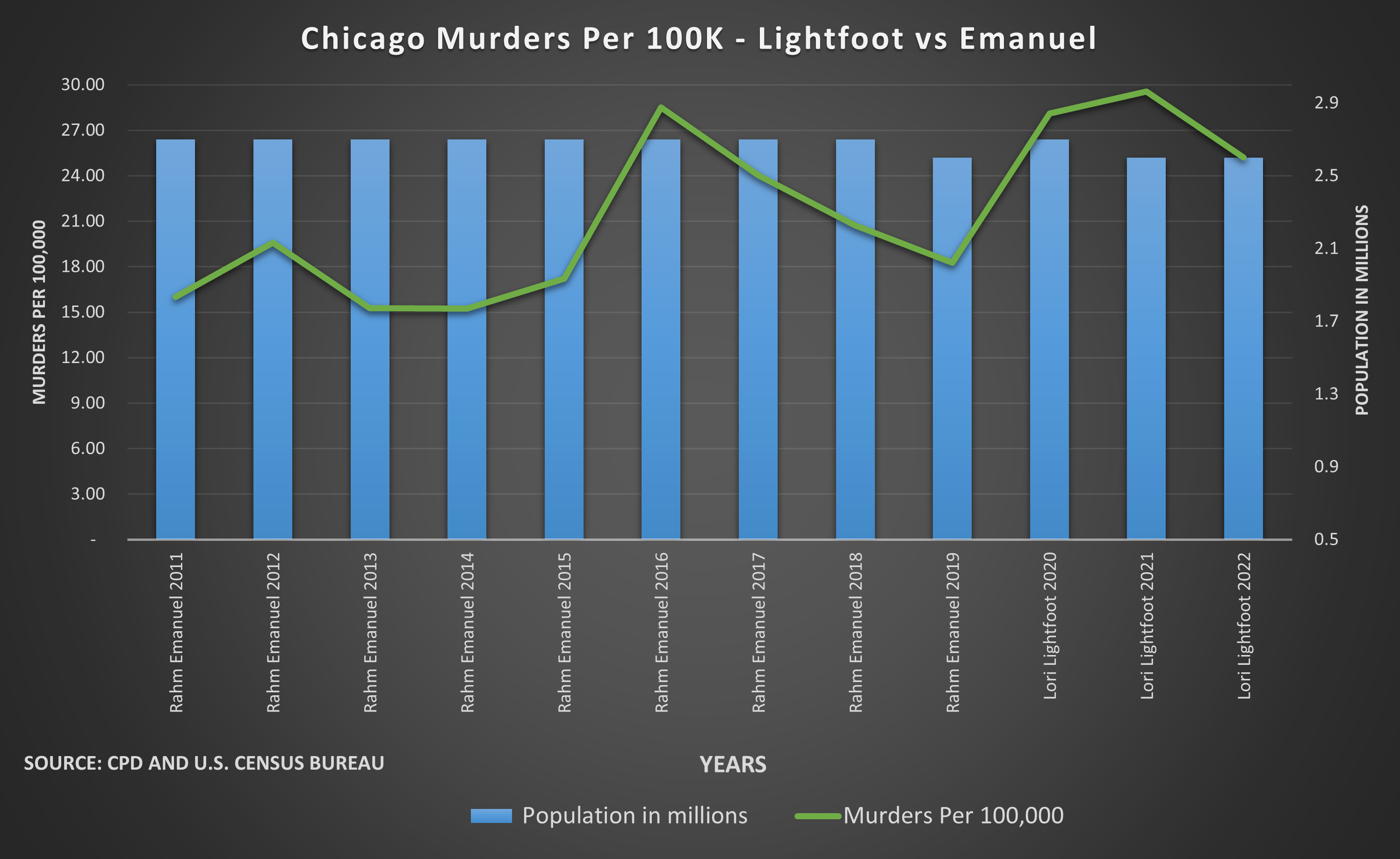
 [OC] Chicago Murders Per 100,000 Comparison between Mayor Lightfoot vs Mayor Emanuel
Submitted by whjkhn t3_11ak0bo in dataisbeautiful
kompootor t1_j9wo9y2 wrote
Reply to comment by aspacelot in [OC] Chicago Murders Per 100,000 Comparison between Mayor Lightfoot vs Mayor Emanuel by whjkhn
Exactly. With Lightfoot's datapoints being essentially entirely measured during the Pandemic (and the known, but still poorly understood, insanity of fluctuation in certain oddly specific crime rates nationwide during the Pandemic), and that roughness of granularity, I recommend rejecting this chart as useless.
(This goes beyond the notion of evaluating one term of a mayor on 3 datapoints of a single crime metric compared to many more terms and many more datapoints of a previous mayor -- one basic problem of granularity is that each datapoint has a certain sampling bias depending on the cutoff -- you can see this yourself by recalculating the murder rate from daily statistics, but use a different year-to-year cutoff date -- that's one type of this bias. It's not a problem with more datapoints depending on the metric, but here you have only 3 for Lightfoot.)
Viewing a single comment thread. View all comments