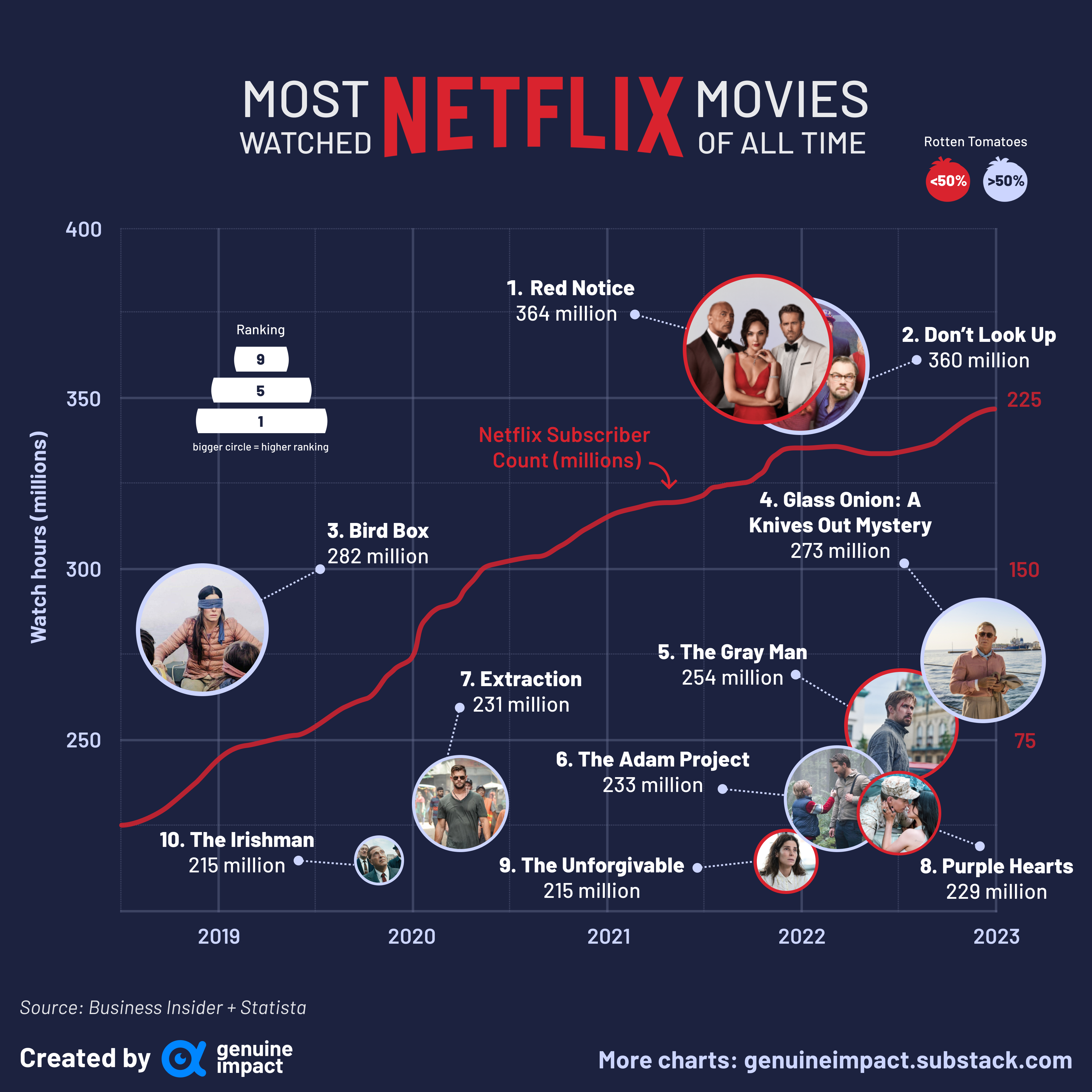
 [OC] Red Notice is the most popular Netflix movie of all time (based on hours watched)
Submitted by giteam t3_10wsdei in dataisbeautiful
JackdiQuadri97 t1_j7p7anu wrote
You fucked up number of subscriber line, the x-axis is different for the two informations you are plotting, the subs number is from 2013 to 2023. Instead of plotting data from mid 2018 to 2023 for that you plotted what would have been the line for 2013 to 2023 over the other graph.
Didn't it look like an obvious mistake that the graph showed netflix 8x their subs in less than 5 year?
P.s. Now that I look at it better actually also the dots are fucked up, places around 20M higher than they should be (i guess prolly a % error), anyway means you fucked up Y axis too
rev_daydreamr t1_j7pmh2z wrote
It's because the dots aren't the points...the larger thumbnails are. Regardless, as I've written in a different comment it is a very confusing choice of graphics.
JackdiQuadri97 t1_j7po1zn wrote
Ah true, my bad then, would have still removed the dots as they create confusion, just keep the name without them
JackdiQuadri97 t1_j7p7xfu wrote
Damn, I noticed also you are advertising your platform to make graphs and such, fucking up everything... This would have been bad if done by an amateur, unreal if this is actually your work
Viewing a single comment thread. View all comments