 [OC] Well-being Distribution based on Income Bracket in the US
Submitted by ketzu t3_11pdcuq in dataisbeautiful
thehallmarkcard t1_jbxnh4u wrote
How does this chart show us anything related to the outcomes of that study and what exactly are you expecting people to be able to see from this chart?
ketzu OP t1_jbxrm3e wrote
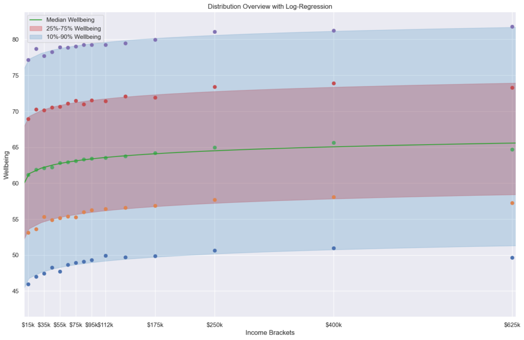
The data lists respondents reported well-being and their income category as well as log of their income and if their income is above $100k, e.g.: 83.59,10.46,35000,0 71.113,12.43,250000,1 69.365,12.07,175000,1
The plot shows the distribution of those responses for well-being in each income category. The width of the violin represents number of responses around that well-being value. The three lines within the violin represent the summary statistics of the Quartiles of the distribution: Q1 (25% of the population), Median(50%) and Q3(75%). While it gives an overview over the whole distribution, it is hard to see much details. That's why I looked into the log regression with summary statistics for myself separately. (Log-regression because the paper noted that the relationship is well known to be log-linear.)
The plot does not directly represent the discussion from the paper and rather summarises the data used in the study. The point mentioned in the paper, flattening of well-being after $100k for the unhappiest high-earners, is a little reflected in the Q1 line, the lowest of the three lines within the violins (although the cutoff is too high, as the paper uses 15% or 20%, but Q1 would be 25%).
I personally think it is interesting to see that for every income category, there is a broad spectrum of well-being. While higher income -> higher well-being seems fairly obvious from the data. The inverse, however, low income => low well-being and high income => high well-being, also seems NOT covered by the data. The spread is too high.
thehallmarkcard t1_jbxswra wrote
So I think those takeaways are a bit difficult to see in this plot. I can see a very modest increase in wellbeing but it’s hard to know if that increase is even statistically significant. The wide distribution across all incomes is interesting but unsurprising of course in every income bracket there are happy and unhappy people. It’s also hard to accurately compare the income brackets because it looks as though the scale for the violin is the same. Ie we would expect the highest income to be “thin” because it’s the smallest population. Standardizing this would let us better see the distributions in a comparable way. I’m not sure if you even have that information available just a comment generally on the plot because the story is hard to pull out from even a moderate viewing.
ketzu OP t1_jbxtyaj wrote
I generally agree, but I think it is a difficult topiy for reddit. I was originally motivated by seeing an article about this study on nottheonion. So I wanted to present an overview of the data as a whole that is hard to construct as "picking data for my agenda" or something along those lines. Reading the (popular) comments in the linked thread (and many similar threads around well-being and poverty) always leave me with the impression that many seem to think that they'd be happy if they just made more money, implying the "reverse" I mentioned before. Unfortunately the paper didn't have a nice overview of the data, just the graph discussing the point they were making - which makes sense for a paper! (Note: For individuals it might be true, not implying that those redditors are wrong per se.)
It also seems that I kinda lost the interpretability because I had some time to play around with the visualization and getting used to what I was looking at... :/ It's hard to notice this when you already know what you are looking at.
[deleted] t1_jbxsrgt wrote
[deleted]
Viewing a single comment thread. View all comments