Submitted by ketzu t3_11pdcuq in dataisbeautiful

Submitted by ketzu t3_11pdcuq in dataisbeautiful
Based on the article: The relationship between income and well-being is well known to be log-linear, i.e., well-being increases based on the log of income, but the spread is fairly wide. One goal of the article seemed to be to investigate the popular "you won't be any happier after making $75k/year" and found that it is not the case, besides a small, unhappy, group.
My personal interpretation is:
More money => more happy, but not as much as one might think. Many are happy while poor and many are unhappy with high income. But that might be for many different reasons: Your level of satisfactions could just move up your baseline for when to feel better: Before, being able to afford a nice steak made you happy, now you can eat steak every day and it just doesn't cut it anymore.
The improvements are "very strong" in the low end (here you can see it better I believe), but not as much later on. If you are unhappy at $75k, I think it is unlikely that a higher income will increase your well-being in the long run (I am pretty sure most people are happy moving up on the income ladder at least short term).
But people are different, maybe for an individual that's exactly what is missing in their lives.
When was the article written. Like what is 75k with inflation?
The $75k figure is from a 2010 study, which would be around $100k this year (the time of the new paper).
That makes sense. I make about 80. And I do feel like if I made an extra 200-300 dollars bi weekly it would make a big difference for me in terms of financial security.
I would imagine happiness does not equal how much you make, but happiness equals how much you make compared to last year.
If you're always improving your earnings, you'll be happy. But if you went from $100k to $75k, that would undoubtedly induce a lot of stress and unhappiness.
How is 'well-being' determined?
In the publication it is measured via smartphone app at random times in the day (with respect to the participants sleeping schedules).
> After providing informed consent, participants completed an intake survey, which included demographic questions as well as two measures of life satisfaction, as detailed below. The participants were next asked to indicate the times at which they typically woke up and went to sleep, and how many times during the day they wished to report on their experiences (default = 3). A computer algorithm then divided each participant’s day into a number of intervals equal to the number of desired reports, and a random time was chosen within each interval. New random times were generated each day, and the times were independently randomized for each participant. At each of these times, the participants were signaled via a notification on their smartphone, asking them to respond to a variety of questions about their experiences at the moment just before the signal. The experienced well-being question was asked in every survey. Other questions unrelated to the present investigation were also asked. The participants received notifications requesting a report until they chose to discontinue participation. If 50 samples had been collected, reporting stopped for 6 mo or until the participant requested that it be restarted.
The paper cited by OP (whose comment appears to be shadow banned) cites two surveys:
Datasource is a scientific article:
I am not affiliated with the article or authors at all, I just used their published data.
The plot was made using seaborns violin plot and some surrounding stuff (file link).
violin = sb.violinplot(data, x='income', y='wellbeing', scale='count', inner='quartile', width=1.3)
violin.set(xlabel="Income Bracket", ylabel="Wellbeing")
violin.set_xticks(range(15), labels)
violin.set_title("Violin Plot of Wellbeing Distribution, Including Q1, Median, Q3 Highlights")
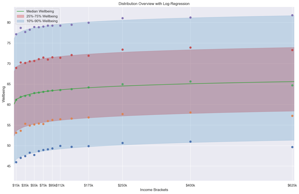
I also made another plot using pyplot to generate statistics accross the income brackets (p10, q1, median, q3 and p90). I like hat one more, but it is even less pretty.
To be honest, this is not a particularly useful visualization.
[removed]
I made a scatter plot. Seems like it tells the story a little better, to me anyway.
It doesn't show the density, but from what I gather is the more you make the less likely you are to be more or less "emotionally well" and more content than either of the extremes.
Line plot basically the same.
What statistics did you use to confirm that the effect is significant?
Eyeballed it. It was 1am at the time and your complaint was about the vizualization.
Otherwise I would probably take the mean of all wellbeing values and discard anything outside 2.5 sigma. To make the visualization nicer I would probably break it down into several brackets as OP has done, but use box plots instead.
Some brackets have people not yet born making money? Life is good.
Maybe there's a misunderstanding, there are income brackets and well-being values, no ages are included :D
Yes, my mistake. I'm so used to seeing age income. The lines below zero, what do they mean?
I think they mean that the violinplot plots too far in one direction if there are large outliers. :/
How does this chart show us anything related to the outcomes of that study and what exactly are you expecting people to be able to see from this chart?
The data lists respondents reported well-being and their income category as well as log of their income and if their income is above $100k, e.g.: 83.59,10.46,35000,0 71.113,12.43,250000,1 69.365,12.07,175000,1
The plot shows the distribution of those responses for well-being in each income category. The width of the violin represents number of responses around that well-being value. The three lines within the violin represent the summary statistics of the Quartiles of the distribution: Q1 (25% of the population), Median(50%) and Q3(75%). While it gives an overview over the whole distribution, it is hard to see much details. That's why I looked into the log regression with summary statistics for myself separately. (Log-regression because the paper noted that the relationship is well known to be log-linear.)
The plot does not directly represent the discussion from the paper and rather summarises the data used in the study. The point mentioned in the paper, flattening of well-being after $100k for the unhappiest high-earners, is a little reflected in the Q1 line, the lowest of the three lines within the violins (although the cutoff is too high, as the paper uses 15% or 20%, but Q1 would be 25%).
I personally think it is interesting to see that for every income category, there is a broad spectrum of well-being. While higher income -> higher well-being seems fairly obvious from the data. The inverse, however, low income => low well-being and high income => high well-being, also seems NOT covered by the data. The spread is too high.
So I think those takeaways are a bit difficult to see in this plot. I can see a very modest increase in wellbeing but it’s hard to know if that increase is even statistically significant. The wide distribution across all incomes is interesting but unsurprising of course in every income bracket there are happy and unhappy people. It’s also hard to accurately compare the income brackets because it looks as though the scale for the violin is the same. Ie we would expect the highest income to be “thin” because it’s the smallest population. Standardizing this would let us better see the distributions in a comparable way. I’m not sure if you even have that information available just a comment generally on the plot because the story is hard to pull out from even a moderate viewing.
I generally agree, but I think it is a difficult topiy for reddit. I was originally motivated by seeing an article about this study on nottheonion. So I wanted to present an overview of the data as a whole that is hard to construct as "picking data for my agenda" or something along those lines. Reading the (popular) comments in the linked thread (and many similar threads around well-being and poverty) always leave me with the impression that many seem to think that they'd be happy if they just made more money, implying the "reverse" I mentioned before. Unfortunately the paper didn't have a nice overview of the data, just the graph discussing the point they were making - which makes sense for a paper! (Note: For individuals it might be true, not implying that those redditors are wrong per se.)
It also seems that I kinda lost the interpretability because I had some time to play around with the visualization and getting used to what I was looking at... :/ It's hard to notice this when you already know what you are looking at.
[deleted]
On a 7-point scale of life satisfaction, billionaires average only about one point higher than college students. (Ed Diener's research)
[removed]
What would happen if you normalized for the number of data points in each income bracket? I'm finding it a bit hard to compare the shapes since some seem to have a lot more data (assuming I'm reading it right).
[deleted]
How do I move into the group that is over 100 regardless of income?
Those super rich are just psychopaths that have no feeling
The idle rich are likely bored. Pair that with people wanting to be around them because they have money, not because they are likable. Makes it lonely, too.
Smallest violin plays
until you become the super rich
sparkyhodgo t1_jbx9fpr wrote
What’s the takeaway, that money has only slight correlation with well-being?