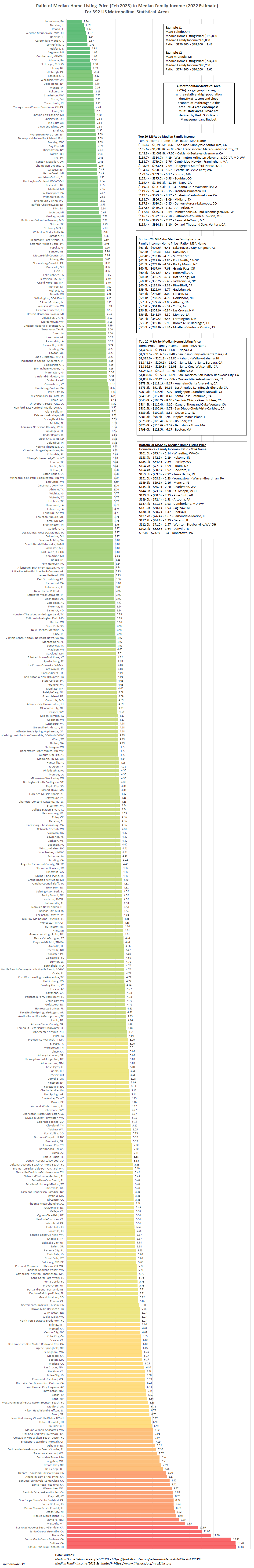
 [OC] Ratio of Median Home Listing Price (Feb 2023) to Median Family Income (2022 Estimate) For 392 US Metropolitan Statistical Areas
aaahhhhhhfine t1_jc00hh8 wrote
I feel like I'd like to see this as a scatterplot. Thought about it as a kind of 2x2, the four buckets are each independently substantively interesting. You might have low income/low cost areas... low income/high cost areas... high income/high cost areas... or high income/low cost areas. It'd be interesting to see how they compare.
Actually... just whipped it up in data commons... basically this:
Viewing a single comment thread. View all comments