Submitted by thedapdude t3_11s15rp in dataisbeautiful
Comments
thedapdude OP t1_jccg8ie wrote
I appreciate the feedback! I've redesigned it and reported values as pure frequency rather than z-scores. Thanks!
Derped_my_pants t1_jccmgx1 wrote
Did you upload the new version? Good job.
commissioner_thanos t1_jcc5bc1 wrote
I have no idea what I’m looking at.
thedapdude OP t1_jccgfry wrote
Thanks for the feedback! I needed to step back and look at the graphic as though I haven't seen the data 100 times before. Graphic has been recreated with simplifications.
commissioner_thanos t1_jccikoq wrote
I’m still pretty stumped by the graph. What does the z-value tell us about the data?
thedapdude OP t1_jcckgeq wrote
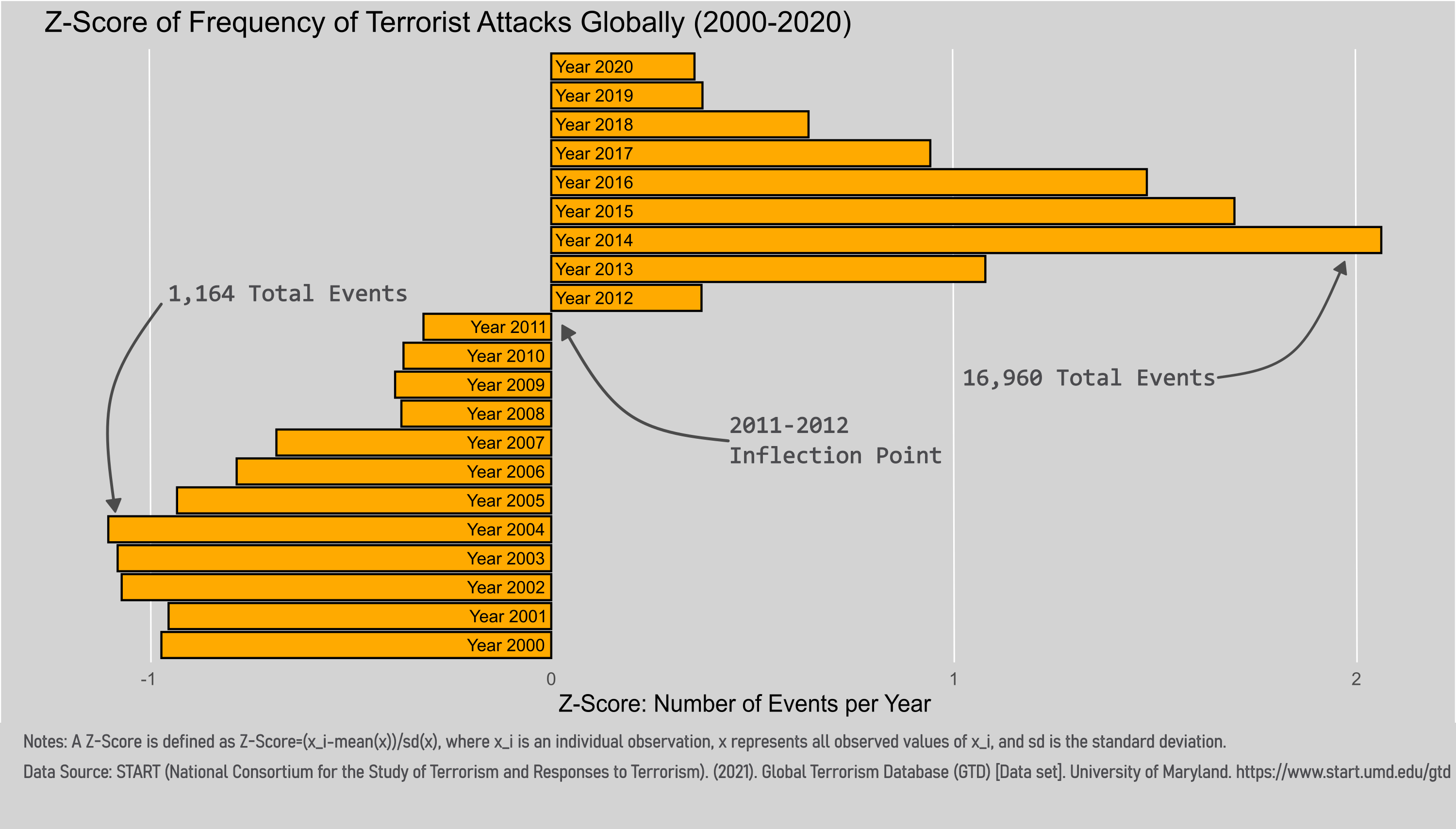
A z-score demonstrates a value with respect to an average (assuming the data is normally distributed) so a z-score of 0 means that a given data point is perfectly average compared to the whole sample while a z-score of 2 indicates that a given value is well-above average. Similarly, a negative z-score implies a value is below average. A really good description of z-scores is posted at https://www.youtube.com/watch?v=16vAjsnazEM.
This graph was meant to show how each year's frequency of terrorist attacks faired compared to the average number of attacks (which for 2000-2020 was 6,660). If my graph was more clear it would have demonstrated that the year 2004 had the lowest frequency and was the furthest away from the mean. While the years 2011 and 2012 were closest to the mean on the low and high end respectively. Year 2014 shows how the total number of attacks that year was furthest away from the mean (16,960 Events). Hopefully, this clears up what my intent was even though I missed the mark.
commissioner_thanos t1_jcclukh wrote
Great explanation, it makes sense now! 🙂
MichaelTLoPiano t1_jcc62xb wrote
But what are the criteria for establishing a value of x_i ?
thedapdude OP t1_jccgyb8 wrote
Each x_i is described as one individual event as recorded in the Global Terrorism Dataset. (Accessible at: https://www.start.umd.edu/gtd)
DisastrousTalk1257 t1_jccko07 wrote
Is the point of this graph to suggest that after 2011/12 there were more terrorist attacks than the yearly mean of the sample? If so I feel like just comparing average yearly attacks in the two groups (before/after 2011) may be more digestible than using z scores.
I_have_no_class t1_jcft5ij wrote
Interesting stats, but a z-score doesn't really work for time series. It hides the most important part (time-based trends) and can be confusing, which you can see in the comments. Z-scores are designed for looking at the relationship between a number drawn from a sample of similar things. Think "My height vs average height of all people."
There are systematic changes that accrue over time that make, say, 2000 more like 2001 than like 2018. That's what you want to show. A bar chart would have been really interesting here, since the number of terrorist attacks swung wildly from 1,000 to 17,000.
thedapdude OP t1_jcb95da wrote
START (National Consortium for the Study of Terrorism and Responses to Terrorism). (2021). Global Terrorism Database (GTD) [Data set]. University of Maryland. https://www.start.umd.edu/gtd (Source)
R Version 4.2.2 and INKSCAPE 1.2 (Tool)

Derped_my_pants t1_jcbwsnw wrote
I would assume this is not interpretable to the average person.