Comments
BroIBeliveAtYou t1_ivaz0bc wrote
Are there any advantages to visualizing it this way --- as opposed to the "tournament bracket" like the one you linked as a source?
[deleted] t1_ivb05jr wrote
[removed]
GreenLoctite t1_ivb0dty wrote
If your not a baseball fan this configuration for displaying data makes no sense.
Miserable_Bus_2299 t1_ivb1bwq wrote
Ig it's a little easier to read
[deleted] t1_ivb2b6p wrote
[deleted]
BroIBeliveAtYou t1_ivb2se3 wrote
Sorry, I just don't see it.
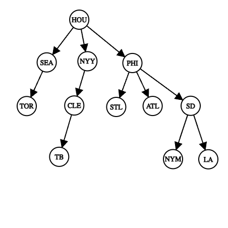
This graph makes it look like the Cardinals (STL) and Blue Jays (TOR) made it further into the playoffs than the Dodgers (LAD). The opposite is true.
nicemap_ t1_ivb3c5p wrote
I think it’s just a different way of visualizing the data. It would be completely redundant to just make another tournament bracket
TravisJungroth OP t1_ivbav3h wrote
You can view tournament outcomes as partially ordered sets. A team that eliminates another is > that team. This visualization only includes that information. It ignores seeding, except for some influence in the left to right sort.
Normally, we think a team is better because they made it further in the tournament. But what if we only compared teams by which beat which? In that comparison, we know PHI > NYM because PHI > SD > NYM. But, we don’t know that PHI > SEA. There’s no path of elimination between them.
Some things that are a bit easier to see here than a bracket: How many teams each eliminated. It’s just their direct children. Who did the worst, or has the most evidence against them? The bottom line teams don’t look so great. They have lots of evidence against them in terms of losing to teams who lost to other teams. SEA and CLE did as well as each other, except SEA lost to the team that won it all.
It’s certainly a different way of looking at it, and I should have explained it more. I think /r/baseball liked it more because it makes more sense if you have a lot of context. A little bit of context and you probably just think “that’s wrong!”.
It’s not much data, and some would say it isn’t beautiful. But I like simple visualizations that make me see things a different way. If I want upvotes, I should make a Sankey chart of my job search.
TravisJungroth OP t1_ivbd6z1 wrote
You might like this more.
Narrow_Hamster_5796 t1_ivc2dqp wrote
This data is not beautiful
[deleted] t1_ivc2dsd wrote
[deleted]
TravisJungroth OP t1_ivc90fn wrote
[deleted] t1_ivck77z wrote
[removed]
Miserable_Bus_2299 t1_ivco05l wrote
Yeah I agree with you just tryna dee what op was thinking
jackssmirkngrevenge t1_ivcsfg0 wrote
This is the most confusing display of a very simple tournament bracket I could imagine
EatShitLeftWing t1_ivnchf1 wrote
Yes, it clarifies that a bracket tournament doesn't accurately determine 2nd place, 3rd place, etc. Because technically the 2nd-best team could have lost to the best team in any of the rounds

TravisJungroth OP t1_ivayepv wrote
Tools: https://csacademy.com/app/graph_editor/
Source: https://www.mlb.com/postseason
/r/baseball thread