 Sex composition of baby names in the USA and England/Wales: 2021 [OC]
Submitted by pncohen t3_zff7ih in dataisbeautiful
Bitter_Arachnid_25 t1_izd8lz9 wrote
Reply to comment by TomSandovalsTrumpet in Sex composition of baby names in the USA and England/Wales: 2021 [OC] by pncohen
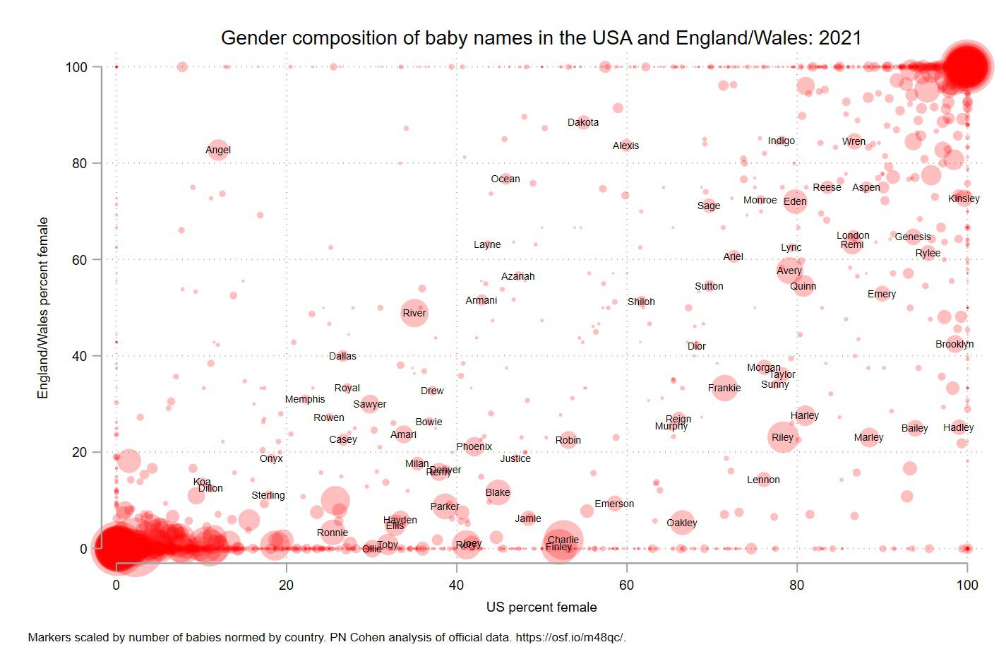
I think it is this: for all the babies born in 2021 having a given name, the location on each axis is the percentage of those babies who are female in either the US or England/Wales.
So for example, for babies with the name Angel: in England/Wales, about 82% are female and in the US, only about 13% are female. In both locations, more than 80% of babies with the name Wren are female and fewer than 20% of babies named Dillon are female.
Some conclusions you could make: In England/Wales, Hadley is more likely to be considered a boy's name (just over 20% female) but in the US, Hadley is almost exclusively a girl's name (nearly 100% female). In both areas, Dillon is a boy's name and Wren is a girl's name.
AdAcrobatic7236 t1_izdtywm wrote
🔥 A chart requiring a three paragraph explanation that may or may not even be correct. Why is this “chart” even here?
FatalTragedy t1_ize6ju8 wrote
I mean it's pretty clear that's how this chart works without that explanation...
AdAcrobatic7236 t1_izf9iog wrote
🔥 My comment, if that’s what you’re referring to, was regarding people having difficulty understanding the chart due to its questionable execution…
FatalTragedy t1_izfk51v wrote
And my comment was pointing out that it's actually an easy chart to understand.
AdAcrobatic7236 t1_izfpak8 wrote
🔥Thank you for clarifying that you were not the subject of my comment…
FatalTragedy t1_izfs1sc wrote
I never claimed I was or was not the subject of your comment, nor was I clarifying what the subject of your comment was.
AdAcrobatic7236 t1_izfvhdd wrote
🔥 Thank you for clarifying your thoughts…
Antrootz t1_izdujx8 wrote
Or at least, include this description next to the chart
FatalTragedy t1_ize6lid wrote
The labels of the axes tell you the same thing as the description, just more succinctly.
Viewing a single comment thread. View all comments