Submitted by pncohen t3_zff7ih in dataisbeautiful
Submitted by pncohen t3_zff7ih in dataisbeautiful
Some of these are just words… Justice, Indigo, River, Ocean?!
A lot of names are "just words":
Daisy, Rose, Dahlia, Petunia, Sally, Sky, Margarita, Hunter, etc.
Who tf is named Margarita
Ocean is very popular in France, Switzerland, Belgium
More like "Océane"
Sure, but it's popular, that's my point
[deleted]
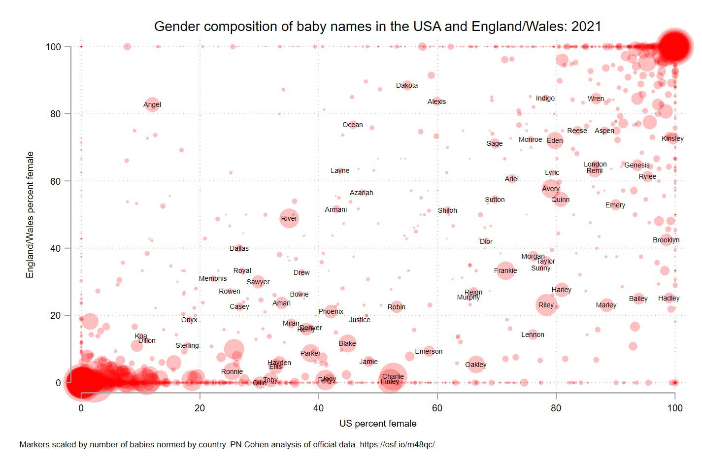
Same. I don't get what this chart is showing?
I think it is this: for all the babies born in 2021 having a given name, the location on each axis is the percentage of those babies who are female in either the US or England/Wales.
So for example, for babies with the name Angel: in England/Wales, about 82% are female and in the US, only about 13% are female. In both locations, more than 80% of babies with the name Wren are female and fewer than 20% of babies named Dillon are female.
Some conclusions you could make: In England/Wales, Hadley is more likely to be considered a boy's name (just over 20% female) but in the US, Hadley is almost exclusively a girl's name (nearly 100% female). In both areas, Dillon is a boy's name and Wren is a girl's name.
🔥 A chart requiring a three paragraph explanation that may or may not even be correct. Why is this “chart” even here?
I mean it's pretty clear that's how this chart works without that explanation...
🔥 My comment, if that’s what you’re referring to, was regarding people having difficulty understanding the chart due to its questionable execution…
And my comment was pointing out that it's actually an easy chart to understand.
🔥Thank you for clarifying that you were not the subject of my comment…
I never claimed I was or was not the subject of your comment, nor was I clarifying what the subject of your comment was.
🔥 Thank you for clarifying your thoughts…
Or at least, include this description next to the chart
The labels of the axes tell you the same thing as the description, just more succinctly.
The x-axis is the fraction of babies with that given name in the US who are female, the y-axis is the same fraction in England and Wales.
Angel in the upper left as example: In the US this is usually a male given name (~90% male, 10% female out of everyone with that name), in England and Wales it's a female given name (~20% male, 80% female).
That 60-80 block for both.
Ariel, Monroe, Eden = 20-25% of those are boys?
And Lync? How does that even get a dot on the chart?
Ariel is a male name in Judaism, e.g. Prime Minister Ariel Sharon
I think that says Lyric, not Lync. Google seems to suggest is is most common in Greece
I'm curious what names would be in the top left and bottom right corners. The intensity of the dots suggests that there's a number of such names.
I've made a list the outliers in this post (not op). It covers more than one year, back 1996, and it's a list if the names with the biggest difference.
On the bottom left are all the names for which there is universal consensus in both Britain and USA that they are considered male. This constitutes the majority of male names, such as John, Mark, Anthony, Matthew etc. which is why it’s so concentrated.
Conversely, on the top right are all the names that both Britain and USA universally consider female.
They didn't say top right and bottom left, though, did they?
So, looking at the graph as a whole the lower right is considerably more busy than the top-left. One interpretation is it appears parents in the US are much more willing to give traditionally "male names" to girls. That empty top-left is interesting too. You may argue that almost no one is giving boys a traditionally "female name" on either side of the pond. Obviously other interpretations are possible too!
Surnames for girls are still popular in the US whereas in the UK they've declined since the 1980s. A good chunk of those bottom half names are surnames, which are still semi popular for boys only in the UK.
Yes this is the most striking conclusion I drew from the graph as well. Essentially,
It's historically true that names almost always pass from being "boy names" to unisex to "girl names", with almost no names going in the other direction. That process is completed with Ashley, it's mostly happened to Leslie and Lindsey, and it's ongoing with Riley, Jordan, etc.
I think the graph implies that this process happens in the US and UK at different moments: Americans start giving boys' names to girls, and only later do Brits do the same. Possibly, Americans are very high-profile in media, so they have disproportionate influence on international trends?
[removed]
[removed]
Good to see this - I think I remember suggesting this last year.
[removed]
This chart would be more beautiful with even more random pink circles.
I wish the axis were of equal length so it was square. Are the bubble sizes the combined number by country? Interesting graph!
you are right it should be square! Probably messes up the perception that it's not. The sizes are the average of the two countries' births per 1000 for each, so it's equally representing the relative commonness of the name in two (unequally size) populations.
Who is calling their daughter Toby?
I'm getting a definite blood spatter vibe from this.
dublin2001 t1_izbpm8v wrote
Is the difference with Angel because most Americans with the name have the Spanish version Ángel? While there are far less with Spanish names in general in England/Wales.