 [OC] Provisional weekly death counts in Canada (all ages, both sex, from 01/2010 to 08/2022)
lopjoegel t1_j0ho3wd wrote
Okay.
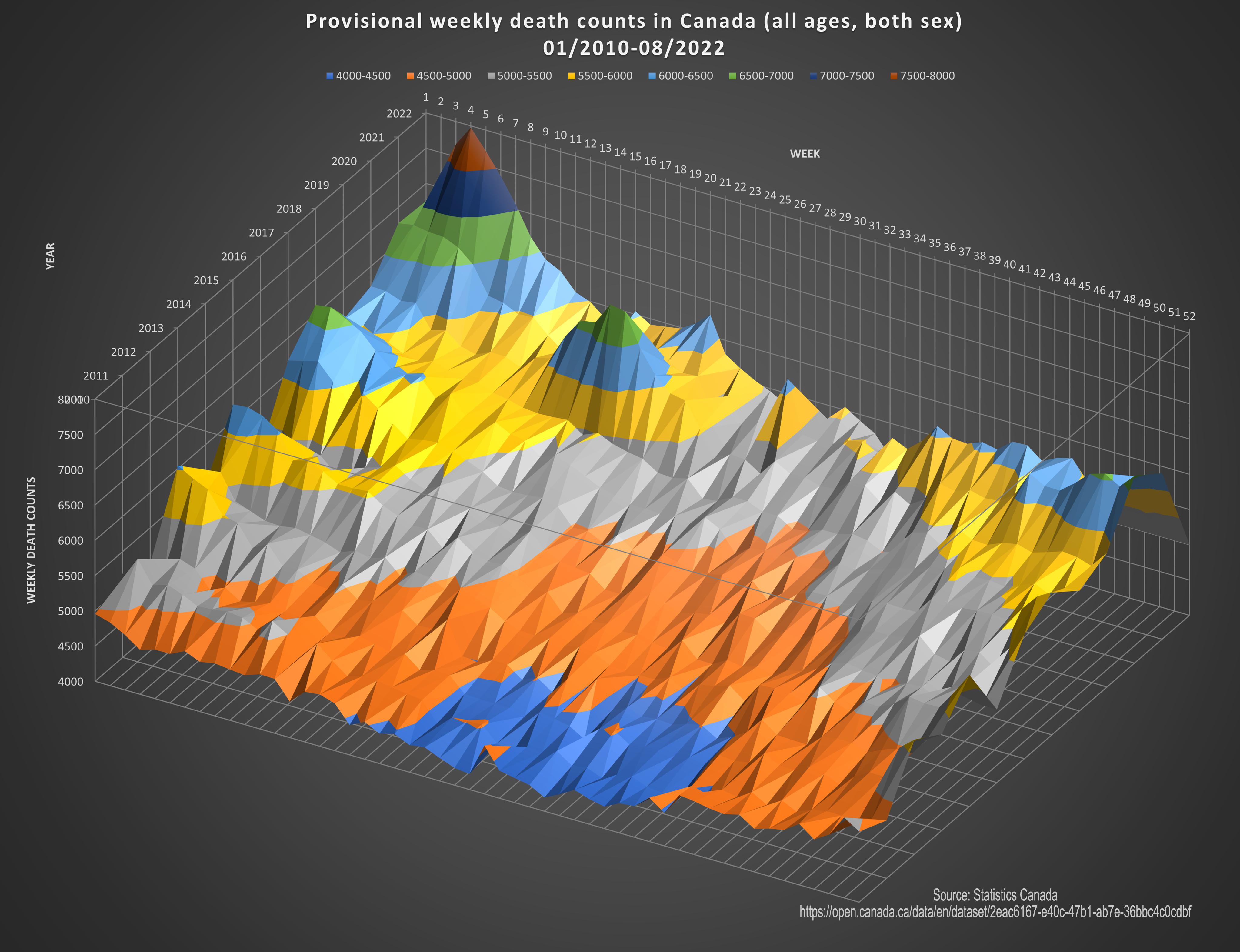
Setting a lower bound for the modeling of 4000 seems to exaggerate the peak range.
Deaths peaked at about double the normal.
Keep in mind that boomers are getting older so the trending for deaths is up as well over the past 10 years.
Statistics can paint a picture but it is abstract and easily distorted.
Southern_Cut_4636 t1_j0i1yij wrote
The cognitive dissonance is strong with this one
OlibriusR OP t1_j0ikm8b wrote
About the scale, we could say that this graph shows excess deaths?
We ca see the boomers trend in the concentric color arcs. (gradual increase per period)
The peaks are anomalies.
Let see this graph in 3-4 years. It should show the same trend without peaks (hopefully).
BaboonBaller t1_j0l996a wrote
I really like this graph. That being said, the population has grown significantly over the span of this report. Let’s say that trend continues, then the number of deaths will grow over time as well (more people exist to die). What I’d like to see is the graph adjusted for population, like financial reports are adjusted for inflation. Then we can see death rates as a percentage of population over time. Please forgive me if this was already incorporated into it. Great graphic
Viewing a single comment thread. View all comments