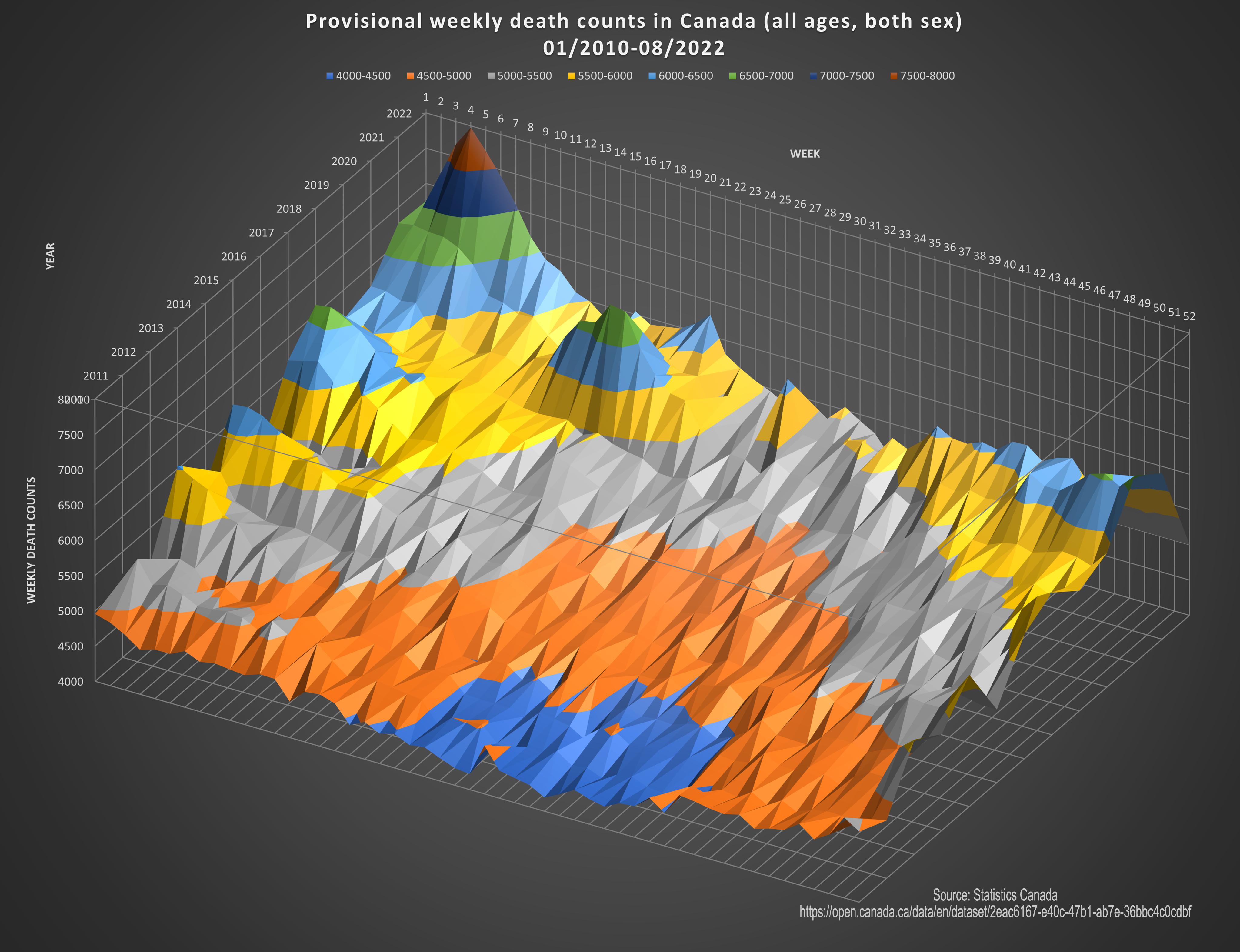
 [OC] Provisional weekly death counts in Canada (all ages, both sex, from 01/2010 to 08/2022)
BaboonBaller t1_j0l996a wrote
Reply to comment by OlibriusR in [OC] Provisional weekly death counts in Canada (all ages, both sex, from 01/2010 to 08/2022) by OlibriusR
I really like this graph. That being said, the population has grown significantly over the span of this report. Let’s say that trend continues, then the number of deaths will grow over time as well (more people exist to die). What I’d like to see is the graph adjusted for population, like financial reports are adjusted for inflation. Then we can see death rates as a percentage of population over time. Please forgive me if this was already incorporated into it. Great graphic
Viewing a single comment thread. View all comments