 I made a Neighborhood wood map of Manhattan. Birch Plywood, LASER Burnt
Submitted by meridian-maps t3_z76loz in nyc
manticorpse t1_iy87dzm wrote
Reply to comment by the_letharg1c in I made a Neighborhood wood map of Manhattan. Birch Plywood, LASER Burnt by meridian-maps
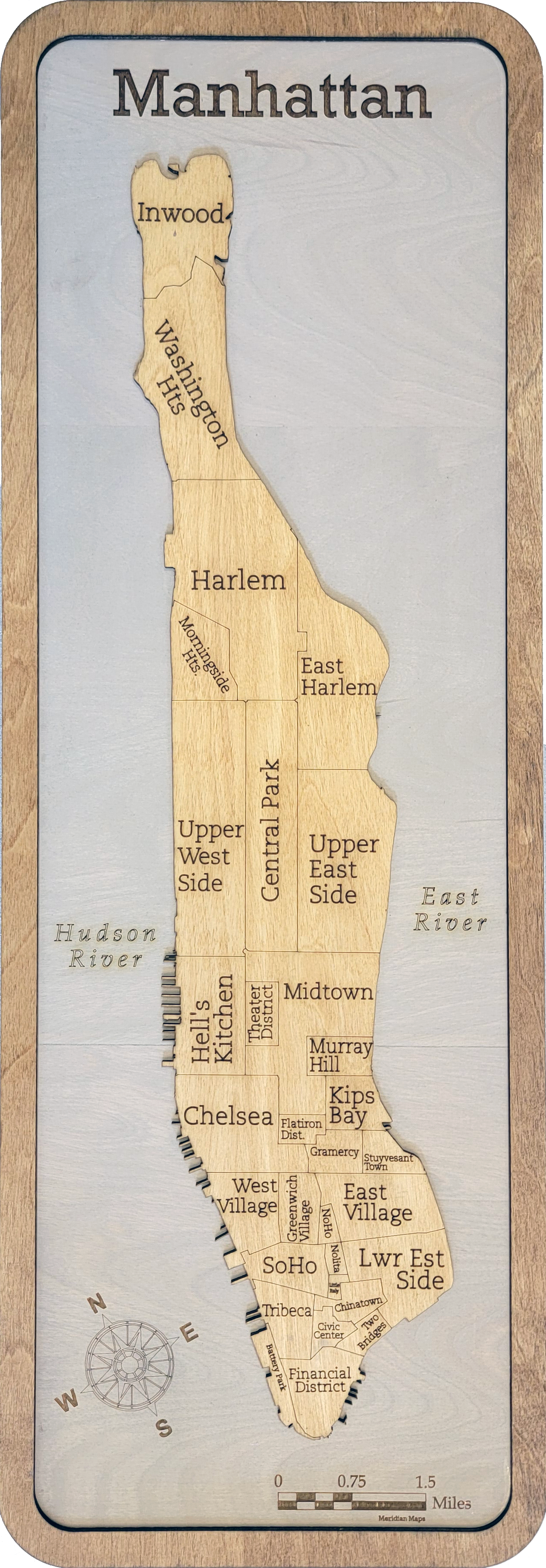
I do like the way "Washington Hts" and "Morningside Hts" are tilted to match the angle of north/Broadway.
I do NOT like the way the word "Heights" was needlessly abbreviated in both of those cases.
I also don't like the haphazard way labels are rotated both clockwise and counterclockwise, nor the way some are left-justified, others are right-justified, and others are centered.
I also don't like that Marble Hill and Roosevelt Island are missing. And I wish Hudson Square was pulled out of Soho.
Still, it includes Inwood, which is ... unusual. And appreciated.
the_letharg1c t1_iy8ghpk wrote
Totally. It’s design chaos with variable type size, weight, spacing, orientation, abbreviation, you name it. Central Park is also not a neighborhood… this piece would really have benefited from some negative space there.
Mattna-da t1_iyajzws wrote
Other than that...
Viewing a single comment thread. View all comments