Comments
lopjoegel t1_j0ho3wd wrote
Okay.
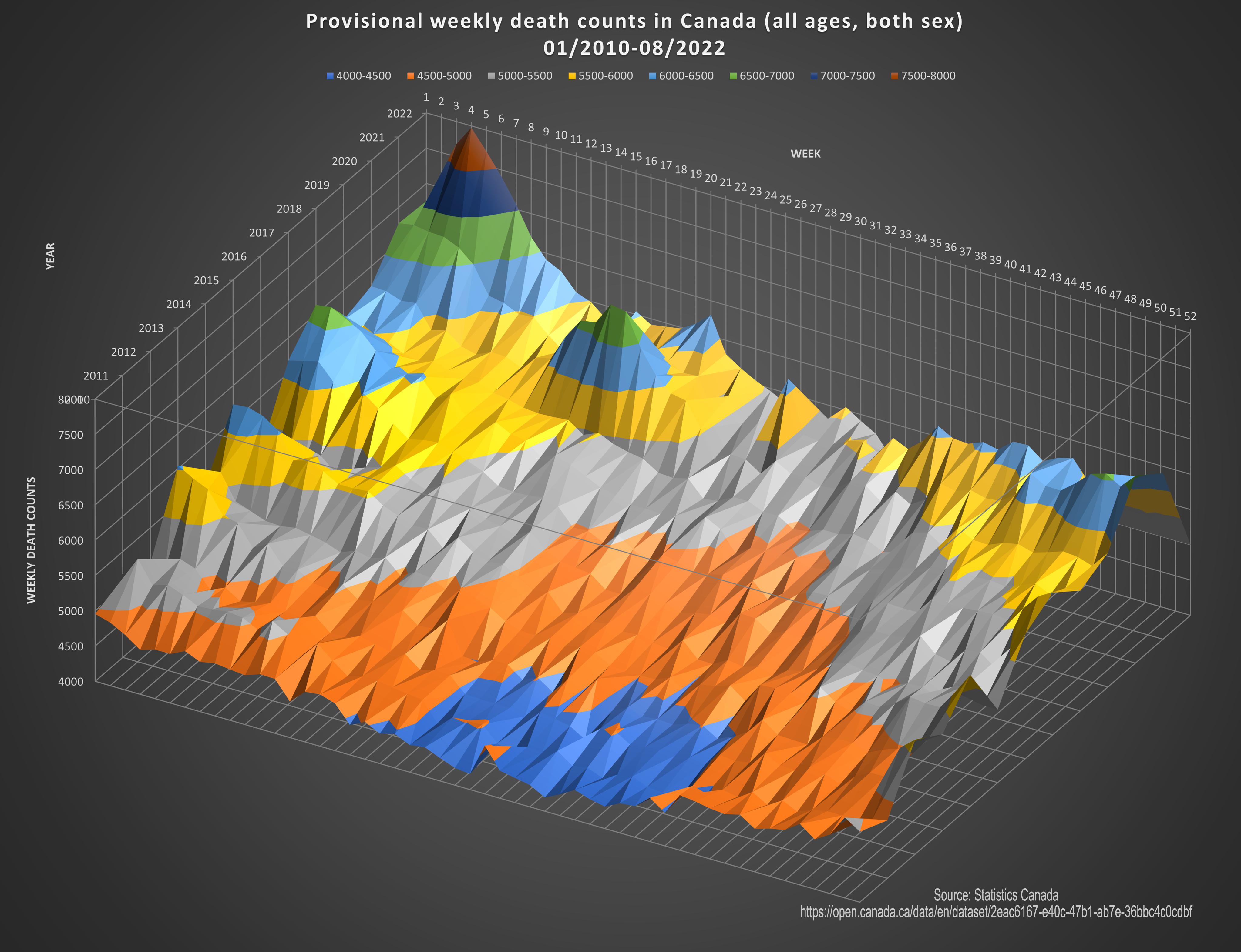
Setting a lower bound for the modeling of 4000 seems to exaggerate the peak range.
Deaths peaked at about double the normal.
Keep in mind that boomers are getting older so the trending for deaths is up as well over the past 10 years.
Statistics can paint a picture but it is abstract and easily distorted.
xenocles_the_lesser t1_j0hombc wrote
What happened early this year?
Dutchwells t1_j0hotoc wrote
Oh I don't know, something with a pandemic or something. Can't remember exactly
xenocles_the_lesser t1_j0hpimi wrote
The disease that started in 2019, for which we got a vaccine in 2021, spiked the death rate so high in early 2022 that not just one, but two contour lines apply only to that period?
mmarollo t1_j0hx3m1 wrote
Shh! Do you want to get banned?
Southern_Cut_4636 t1_j0i1yij wrote
The cognitive dissonance is strong with this one
rabbiskittles t1_j0ih95l wrote
I was right there with you thinking there’s no reason COVID would cause a random spike right there, but I looked it up and apparently there was a huge spike in cases right around then: https://www.healthdata.org/sites/default/files/covid_briefs/101_briefing_Canada.pdf
fwubglubbel t1_j0ijn7o wrote
A simple line graph would be much more effective. This is just hideous.
OlibriusR OP t1_j0ikm8b wrote
About the scale, we could say that this graph shows excess deaths?
We ca see the boomers trend in the concentric color arcs. (gradual increase per period)
The peaks are anomalies.
Let see this graph in 3-4 years. It should show the same trend without peaks (hopefully).
OlibriusR OP t1_j0iky8p wrote
Like this? https://www150.statcan.gc.ca/n1/pub/71-607-x/71-607-x2020017-eng.htm
I find it a bit overwhelming and doesn't show the 10 years trend.
xenocles_the_lesser t1_j0inx3r wrote
There definitely was a COVID spike at that time. But if you look at Figure 3.1 in the report, which seems to match the shape of the Worldometer graph I looked at first (https://www.worldometers.info/coronavirus/country/canada/) I see a death spike that isn't appreciably higher than the ones before, and possibly skinnier. While COVID might have contributed to this total death rate peak, I am not at all convinced that it was the major driver of it.
foldingcouch t1_j0iv584 wrote
Two things:
- Hospitals everywhere in Canada are short on staff and high on cases as COVID continues to be a thing and ...
- The flu is particularly bad this year, with a ton of pediatric patients eating up a lot of hospital beds and resources
So we have a double-hit of COVID season and flu season hitting at a time when hospital resources are already stretched beyond capacity - people are going to die.
xenocles_the_lesser t1_j0iy3m4 wrote
You're saying "are" as if you're talking about the present flu season. Just to be clear, this spike was at the end of January.
foldingcouch t1_j0iz20q wrote
Oh well then shit's about to get a lot worse.
NUTTTR t1_j0j55rb wrote
Yeah I don't think that's better, I think your version probably has more grain than you'd want at first glance.
BaboonBaller t1_j0l996a wrote
I really like this graph. That being said, the population has grown significantly over the span of this report. Let’s say that trend continues, then the number of deaths will grow over time as well (more people exist to die). What I’d like to see is the graph adjusted for population, like financial reports are adjusted for inflation. Then we can see death rates as a percentage of population over time. Please forgive me if this was already incorporated into it. Great graphic
[deleted] t1_j0locf5 wrote
One in every crowd
aa821 t1_j0lxbm6 wrote
Did I say something wrong, or are you just uncomfortable that these facts shed light on the status quote of contemporary political discourse?
Trombone66 t1_j0m3wc4 wrote
If assisted suicide didn’t occur, the death rate would be the same. Those deaths would just move into different categories. However, if human suffering could be graphed, I can only imagine how much higher it would be without assisted suicide.
The_Real_Tippex t1_j0tg22p wrote
I’m just wondering why most deaths happen early in the year.
OlibriusR OP t1_j0hlvra wrote
Made with Excel
Source: Statistics Canada
https://open.canada.ca/data/en/dataset/2eac6167-e40c-47b1-ab7e-36bbc4c0cdbf