Submitted by No_Statement_3317 t3_zoxccq in dataisbeautiful
Comments
jessicathehun t1_j0pdtwo wrote
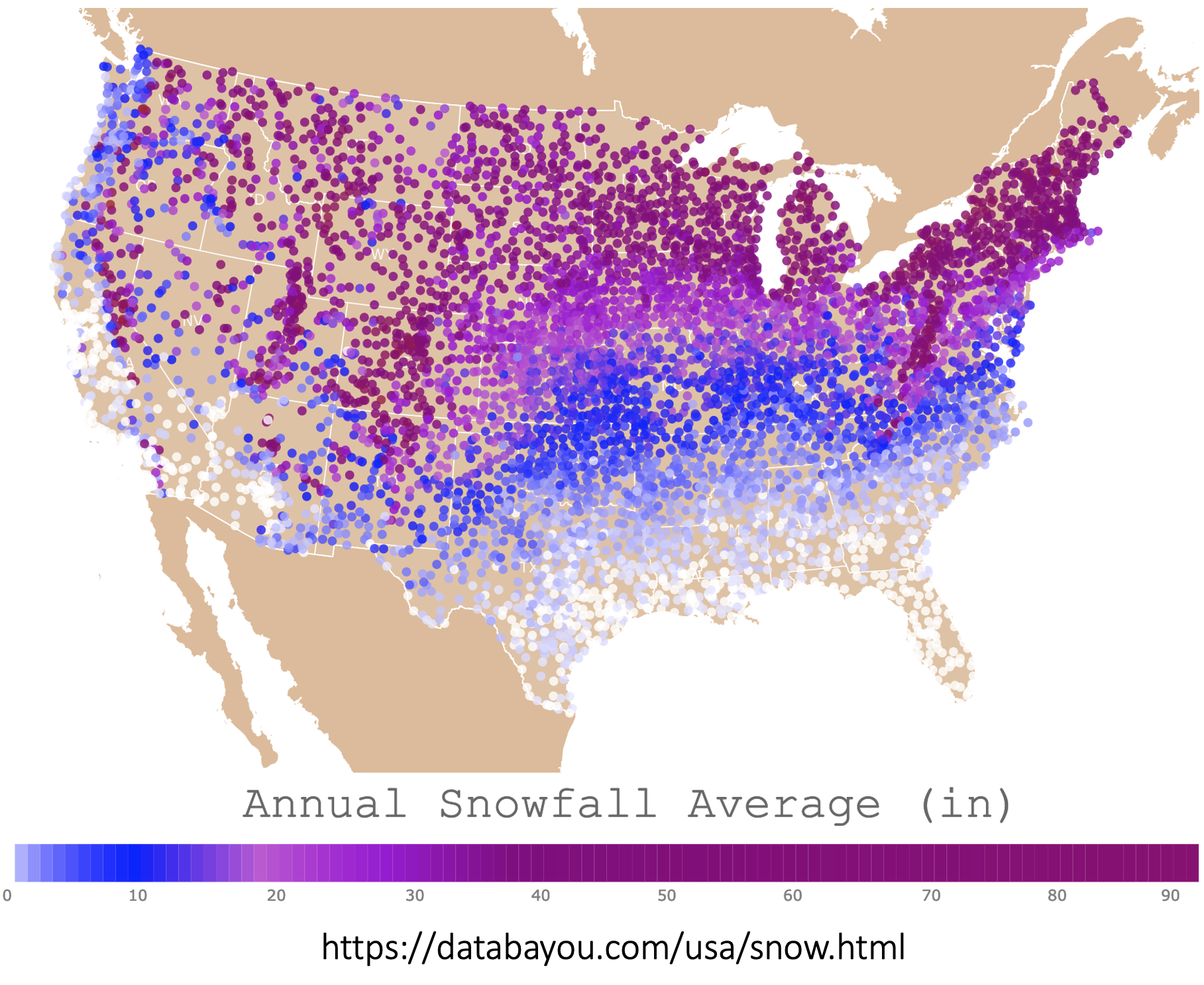
Why is 40 the same color as 90? What does it mean when a location is brown?
EmperorZwerg1995 t1_j0pe4op wrote
Why is there literally zero visual discrepancy across 2/3 of this color scale
ScarabLordOmar t1_j0pf4ag wrote
Probably no location that reports to national weather service. I’m in one of the shitty places that’s higher yearly average than the highest number on this scale.
KingKaiSuTeknon t1_j0phald wrote
It is also a test for colorblind and I got some bad news bro.
KingKaiSuTeknon t1_j0phdjj wrote
Big mountains and rain shadows.
goldfishpaws t1_j0pify0 wrote
Zero snow is white and lots is purple! Infographics generally benefit from being instinctive, so for instance rainfall shown in blues, sun as yellows, so it might be worth stepping back to the project thinking about colouring and what it conveys in itself, to make it feel more instinctual :)
EnvironmentalCry3898 t1_j0pk05s wrote
40 to 90 the same color.
its only 4 feet, who cares right?
sometimes I visit the tropics of southern new england to drop off some feet of snow.
embeddedanthro t1_j0pmb7b wrote
Consider updating the color scale! 40” and 90” have the same color. A better color scale would greatly improve this graphic.
Spring-Dance t1_j0pz6c3 wrote
If anything OP might be one of those women that can see 100 million more colors than everyone else.
Macrophage87 t1_j0pza70 wrote
Contour lines would look way better here
Purplekeyboard t1_j0qc0c8 wrote
Surprising to find out that florida receives the same amount of snow that much of the Rocky Mountains receives.
Or, maybe the graph shouldn't use the color tan to mean "I don't know".
nemanja1a2a t1_j0qqz9k wrote
I see only 4 colors
[deleted] t1_j0qyjmu wrote
[removed]
bassoonprune t1_j0r54eu wrote
Moving from a dark purple dot to a white dot was one of my better life decisions.
bigbluedoor t1_j0rcolr wrote
Sunday river yesterday couldn’t keep their lifts running with the outages lol, it was a real shitshow
Simond876 t1_j0rmt7r wrote
The Santa Rosa and San Jacinto mountains are down there. Sky islands that rise 10,000 feet above the surrounding desert
GreenleafMentor t1_j0ryifa wrote
40-90 are basically the same color. So many maps i see here recently have bad color gradients....why? The data is supposed to be beautiful.
DarkRajiin t1_j0ryzis wrote
Damn, I always love snow but we never get enough here. I wouldn't want to move and sacrifice having coastal area just for snow though
GoodTechnician t1_j0sbzty wrote
Symbology/scaling is plain wrong, and why not grid to fill in the nulls? Fail.
ReluctantRedacted t1_j0se5rb wrote
Pacific Northwest is the best place above latitude 35
uberjam t1_j0sgaeg wrote
Ah whew. Thought it was just me.
Yeah this is a terrible graphic.
pookiedookie232 t1_j0so5gh wrote
Did I just learn I am colorblind or something?
danjlwex t1_j0spjtj wrote
The top four snowiest places are all on the west coast (Wikipedia). They are all significantly higher total average snowfalls than any other places on the east coast. If you had a special color for the very top end of the gradient, this would be much clearer. Oddly, you have this at the low end already
monozach t1_j0sq2ah wrote
Totally see where you’re coming from, and not sure if it’s maybe just a regional thing, but where I’m from the above coloring is exactly what they use on radars to show the amount of snow a given area is expected to get.
Are you possibly from a place that doesn’t get much snow? Or does New England just use weird coloring schemes lol
R_V_Z t1_j0ss8fz wrote
Because anything more than 40 inches is "way too much".
hunterxy t1_j0suxxg wrote
Because after 3ft, does it really matter anymore? You're buried in snow.
The_Illist_Physicist t1_j0svrdl wrote
I'm in the opposite boat. Went from a white dot to a mid shade of purple and couldn't be happier! Although more of that had to do with getting tf out of the South than anything related to climate.
Johnny_no_5 t1_j0t0i8o wrote
Great concept...but needs more range in the colorization. No discernible granularity (for me, at least!) beyond ~40".
adjective-study t1_j0t1a3q wrote
That or make the ocean a different color. Half of California has disappeared.
Pirate_Green_Beard t1_j0tnr25 wrote
I've always seen weather maps use a green to red gradient, with green being a drizzle and red being a downpour or blizzard.
But that's for maximum contrast.
EmykoEmyko t1_j0tqvcz wrote
Annually! That just a bit here and there for seven months.
AuntRhubarb t1_j16yxke wrote
Yes. a BIG miss on the UP snow belt.

No_Statement_3317 OP t1_j0pceia wrote
Made with D3.js, data from Snow-Inventory, NOAA National Centers for Environmental Information. Link to the map here https://databayou.com/usa/snow.html