Submitted by Revolver-Knight t3_z31dow in iphone
Comments
buttertoast313 t1_ixjvd6s wrote
It only works sometimes for me. But looks great when it does
Zcott t1_ixjzyuy wrote
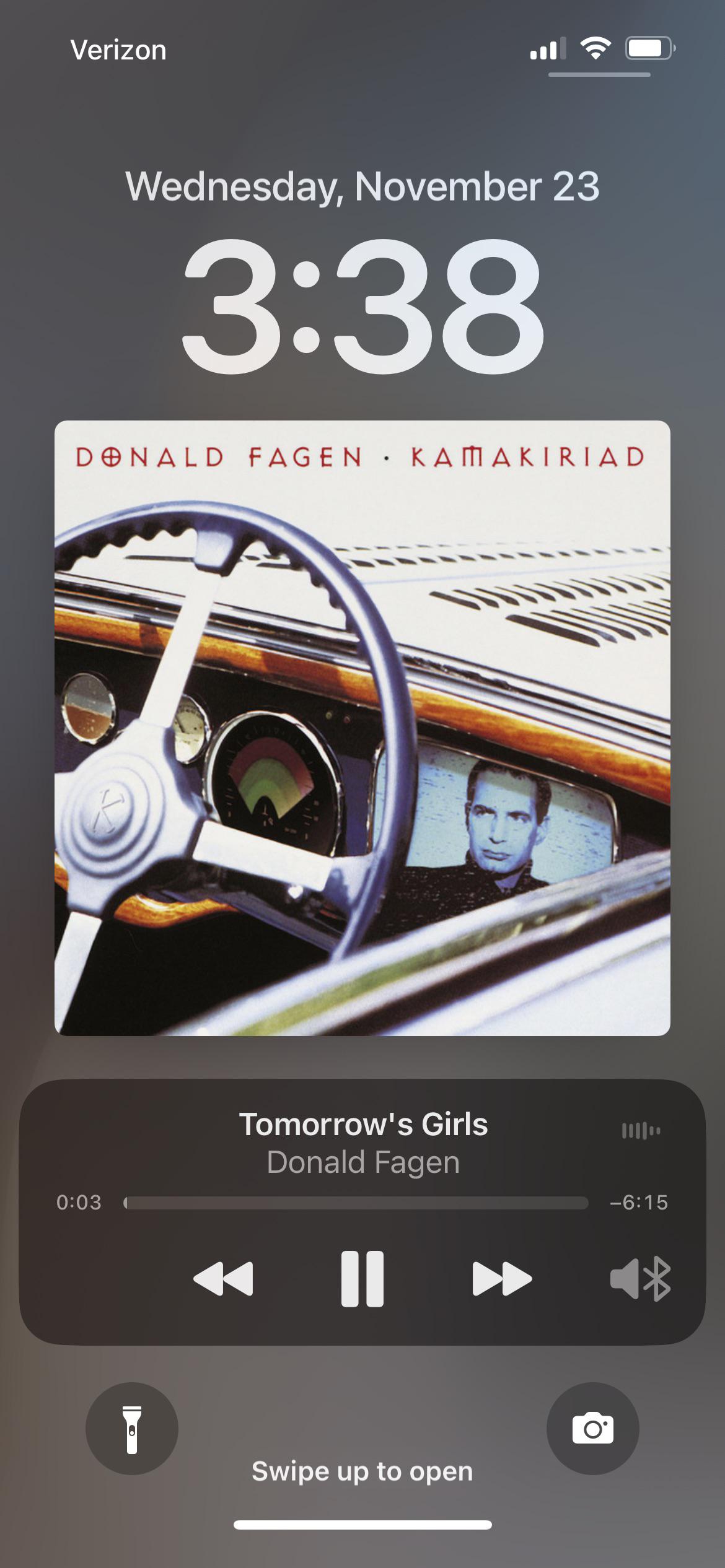
Tap the album art and it works every time
bushwickrik t1_ixk50t2 wrote
Great album!!
theunquenchedservant t1_ixkcyc7 wrote
I dislike that it's so easy to get rid of, i often accidentally tap the album image and it shrinks again. on the other hand, there are times i dont want so it is nice that it's convenient
TeacherOfFew t1_ixks0hf wrote
Don’t love the album, but that’s one of my all-time favorite album covers.
Business-Parsnip-939 t1_ixl1sdl wrote
They originally planned to have them, but with the new bottom notifications system it was taking up too much space, almost like the previous notification system had some benefits and they were just making this change for the iPhone 14 Pro
Business-Parsnip-939 t1_ixl1vbv wrote
If you go test out a display model iPhone SE, the “large” album art is as small as the normal view, very poor design on Apples part
PiracyIsCaring t1_ixl2gnh wrote
Reminds me of Google Play Music but the album art fits on the screen.
Sucxces_93 t1_ixlfbkz wrote
Thanks. Listening to this music I imagine I drive on the California road with a smile on my face.
Psyops42 t1_ixliqxv wrote
Also love that the colours blur out in the background 😍 especially with colourful album covers.
Idontmatter69420 t1_ixlvvp7 wrote
I also like it, and wdym again? Did it happen on an older iphone that i didn’t have
Upbeat_Foot_7412 t1_ixmb792 wrote
iOS 10 was the last time that we had the big album artwork on the lock screen.
woflcopter t1_ixmuz5j wrote
It's annoying because if you basically tap anywhere on the screen the big album art goes away. So that's why it's very easy to make it smaller. But you'll almost never accidentally make it bigger because expanding it requires you to click on the small album art, which is more deliberate.
BigTittyDaddy t1_ixmyy7x wrote
apple users when apple brings back 10 year old features> OMG OMG SDAFAFDAGASEGEG!!!11
cirogaetano t1_ixn2f87 wrote
Just annoys me that album cover won't have same width as the box under it.Graphic designer things I guess lol
Dutch_Fudge t1_ixn3seu wrote
Does this only work with Apple Music? I don’t get this with Spotify..
atz83 t1_ixn4my1 wrote
Bring it back? When was this a feature (I’m new to iphones and when I got my 13 it was on ios 15.5
Idontmatter69420 t1_ixn5mbr wrote
I did have an iphone 5c in 2017 but probably didn’t see it as I wasn’t into music then as i am now
squareswordfish t1_ixn81uv wrote
I think this was on iOS 10. Basically, the whole screen was a player instead of being like a widget.
Here’s an older post I found comparing the lock screens between iOS 10 and 11
squareswordfish t1_ixn88mr wrote
If you click the art it toggles between full screen and just a small square on the widget
squareswordfish t1_ixn8fnk wrote
Definitely works with Spotify. Try clicking the small art cover, that makes it larger
Dutch_Fudge t1_ixn9z2e wrote
Ah it works haha, thank you!
squareswordfish t1_ixnb6eb wrote
Great to hear, no problem!
sfernandes30 t1_ixneabb wrote
Yea if you tape the lil art it makes it full screen while on the lock screen
atz83 t1_ixnevob wrote
Wow, it’s beautiful! But I prefer having the controls on the bottom. I guess this wasn’t an issue on older smaller iphones
evilbowlofcereal28 t1_ixnmeo5 wrote
When are they gonna give us back the volume controls in the Lock Screen and when you swipe down on the screen when listening to music, that’s what’s beeping me from downloading iOS 16
Upbeat_Foot_7412 t1_ixnpz0u wrote
Still got an iPod Touch 6th Gen on iOS 10. Damn I miss the old pre iOS 14 white music icon.
Idontmatter69420 t1_ixphdtj wrote
I also have a 6th gen ipod touch but I believe it’s on ios 12. Something

coolaaron88 t1_ixjepxd wrote
Love that man’s music and by extension Steely Dan ❤️